Michigan Debt Case Court Forms Redesign
- My Role
- President, Project Director
- Location
- Ann Arbor, MI
- Tools
- Figma
- Timeline
- September 2025 – January 2026
What
Redesign the notice and answer form a defendant receives in a Michigan debt collection case, so someone reading them without a lawyer knows what is happening, what to do, and by when.
Context
In Michigan debt collection cases, 70% end in default judgment because the defendant never responds, and only 3% of defendants have a lawyer, against more than 90% of plaintiffs. The Michigan Supreme Court’s Justice For All Commission asked Mintify to test and redesign its plain-language drafts of the two documents a defendant receives: the Advice of Rights notice and the Answer Form. Michigan’s courts are not digitized, so these stay on paper. Our research — tabling at two public Ann Arbor locations and on campus, plus interviews and surveys, distilled through an affinity diagram into two personas and two journey maps — found undefined legal jargon, confusion over what to do next, intimidation by the documents themselves, an unclear right-to-a-jury section, and plain information overload.
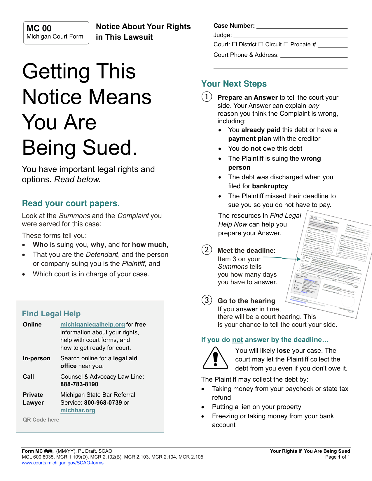
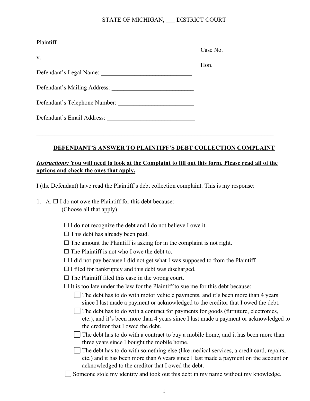

The Commission’s plain-language drafts we started from: the Advice of Rights, and both pages of the Answer Form
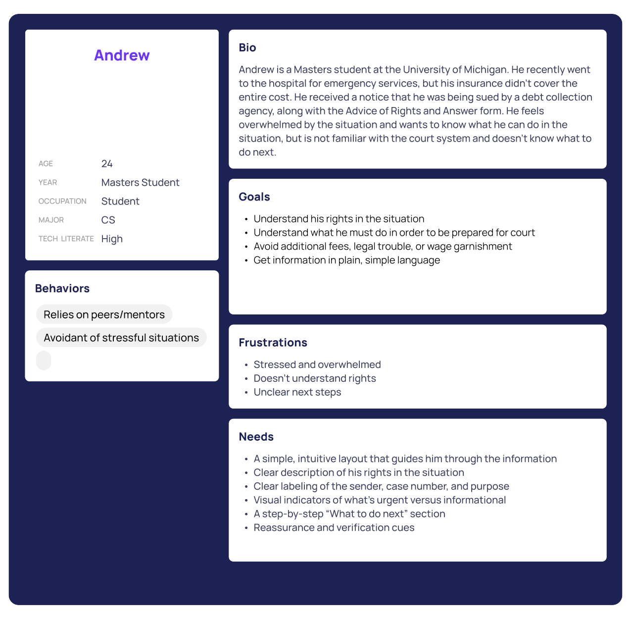
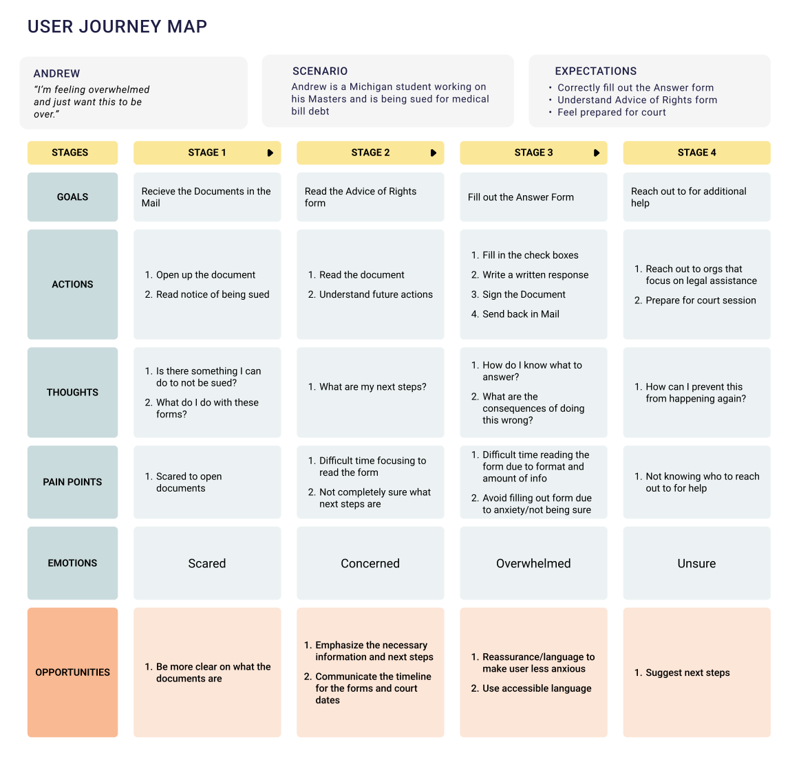
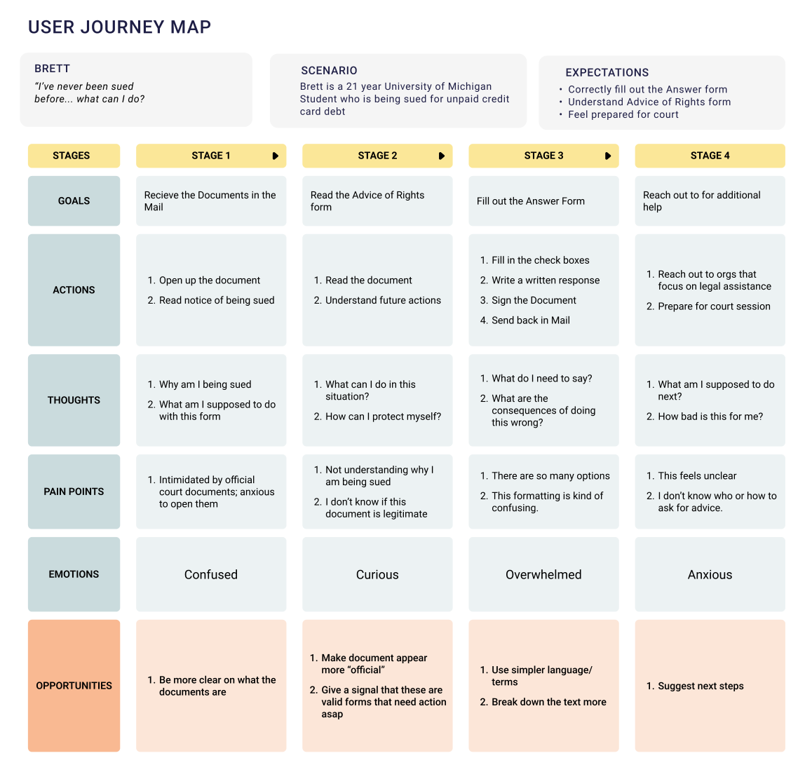
From our research: Andrew, a CS graduate student who still had no idea what to do, and two journey maps whose emotions never improve
Constraints
- Paper, not a product. Michigan’s courts are not digitized, so every fix had to work on a printed page, and anything online had to be reachable from paper.
- Readers with no one to ask. With 97% of defendants unrepresented, the forms had to explain themselves to someone reading them alone, frightened, and possibly unsure the letter is even real.
- Ten people, one set of documents. I directed a 10-person team split across analysis, research and design, so mid-fidelity meant merging several designers’ variants into one direction.
- Testing at student scale. Four usability participants, about 30 minutes each, were enough to find where people stalled but not to measure it — that is the job of the randomized controlled trial the Commission planned.
Key Features
Three steps, side by side
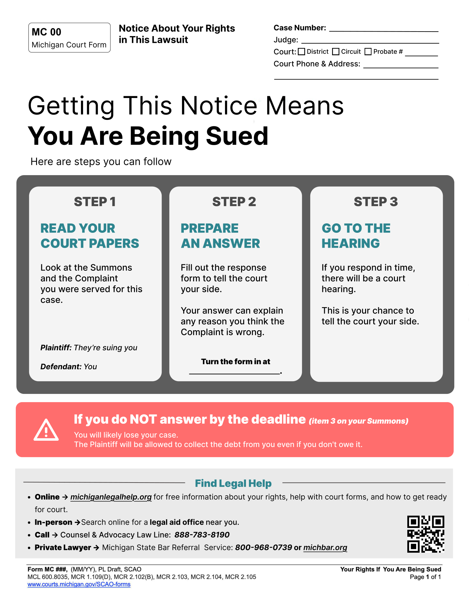
The draft split its instructions between a “Read your court papers” section and three numbered next steps. The redesign makes them one row of three cards in reading order — read, answer, go to the hearing — applying Hick’s Law to cut the decisions in view.
Jargon defined where it appears
Research found “plaintiff” and “defendant” undefined, so Step 1 now says it plainly: Plaintiff, they’re suing you; Defendant, you.
Less to read
The draft’s lists of possible defenses and collection methods came out of the notice, leaving only what a reader needs to act — the answer to our information-overload finding.
The deadline in red
A warning icon beside a paragraph became a full-width, high-contrast red block that also says where to find the deadline: item 3 on the Summons.
Legal help in one place
Every route to help — online, in person, by phone, a private lawyer — sits in one full-width panel at the foot, with a scannable QR code where the draft had a placeholder.
Two paths, split twice
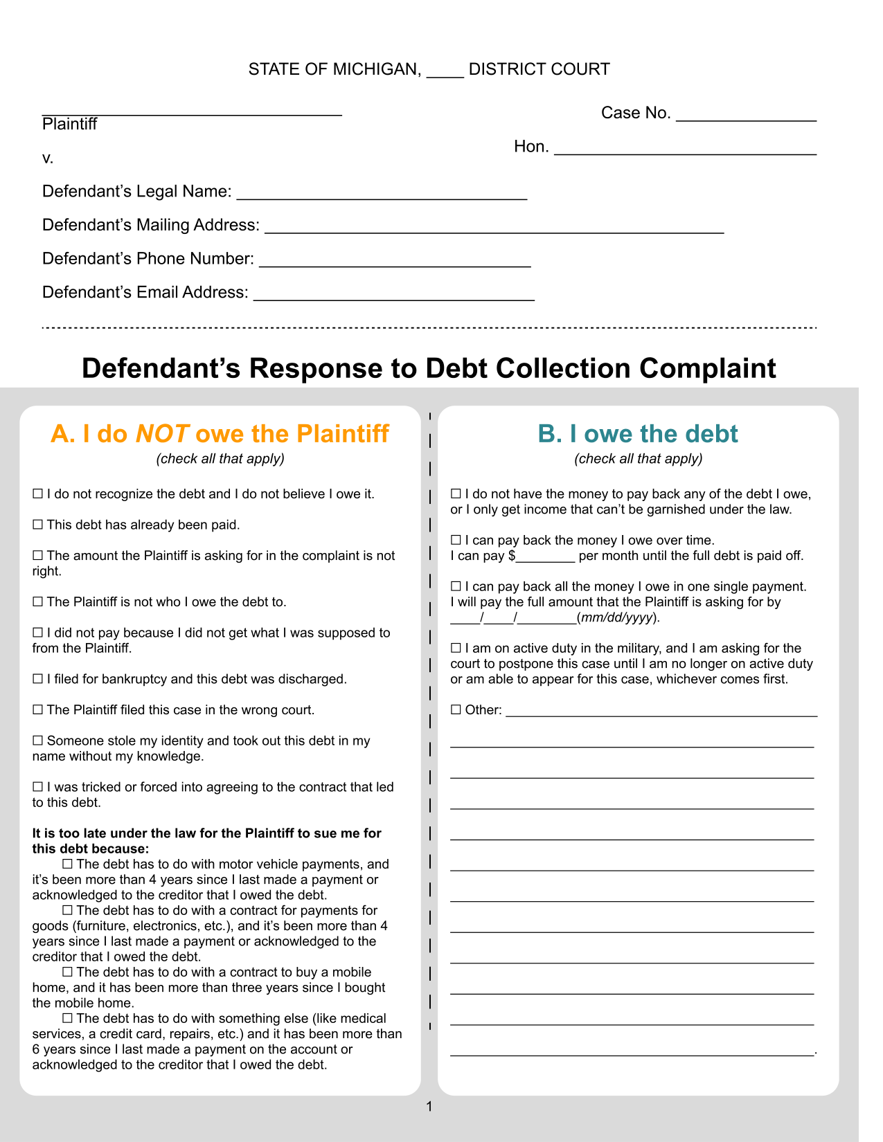
On the Answer Form, “I do not owe” and “I owe” sit side by side and in different colors, instead of one after the other, so a reader never reads the half that does not apply. Folding the active-duty checkbox into an existing section cut three sections to two.
A question, not instructions
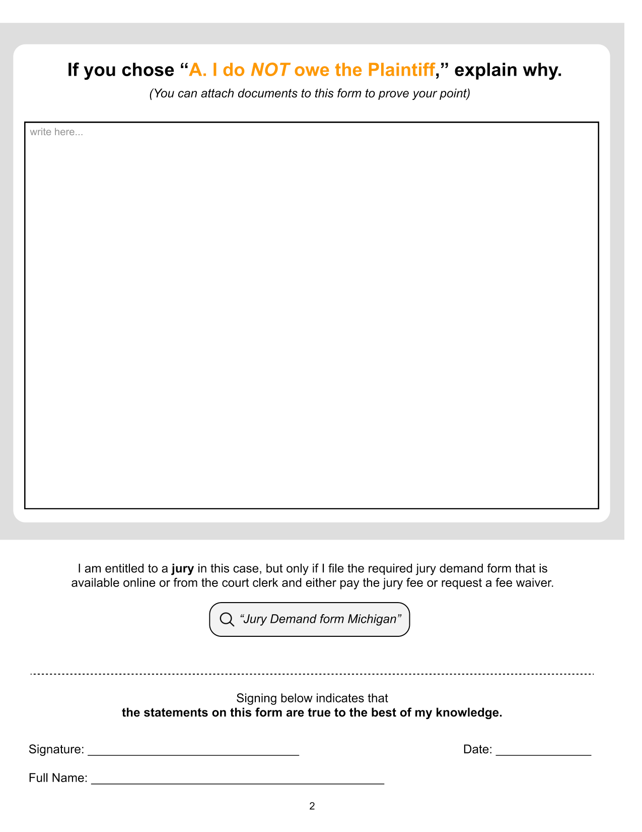
The draft put a bold paragraph of instructions over the write-in box. The redesign asks one direct question in path A’s color — “If you chose A, explain why” — and gives the box more of the page.
The jury right, made findable
In the draft, the right to a jury was one numbered sentence whose “online” and “fee waiver” were hyperlinks, which do nothing on paper. Now “jury” is bolded, and the search a reader would need is drawn as a search bar — a picture of the next action.
Final Deliverable
Reflection
The finding that shaped the redesign came from the persona we expected to struggle least: a computer science graduate student with high tech literacy who still had no idea what to do. The barrier was the document, not the reader, so every decision went into plain language and order rather than more instruction. A second persona’s first question — is this letter even real? — turned the form number, court address and citation from boilerplate into content.
Directing ten people taught me that the hardest design moment was the mid-fidelity merge: combining several designers’ variants into one direction without averaging away what made each of them work.
What I would do differently is bring older participants in at the start, not only at the end. Our usability sessions were with University of Michigan participants, and both of our research personas landed in their early twenties. We were able to get some older people to test the final forms, but ideally people from that same demographic would have tested the Commission’s original drafts first, during the research phase, so the redesign answered their difficulties from the beginning instead of being checked against them at the end. The measure that matters is the Commission’s: whether fewer of these cases end in default judgment.