Dante
Garetto
← All projects

Luca AI Website Redesign

My Role
UX Product Design Lead Intern
Location
San Francisco Bay Area, CA (Remote)
Tools
  • Claude / Claude Code
  • Webflow + Webflow MCP
  • GSAP
Timeline
May – July 2026
Tags
  • Information Architecture
  • Visual Design
  • Front-End & No-Code Build
  • AI & SaaS
  • Marketing Website

What

Make Luca AI’s text-heavy Webflow marketing site scannable on any screen without rewriting its AI-optimized copy, and ship it as native Webflow components the team can edit without code.

Context

Luca AI’s marketing site carries a large body of AEO/GEO-optimized copy, written for AI crawlers and answer engines as much as for people, and that copy was largely fixed. The CEO handed me the front end of four pages — Homepage, How It Works, The Agent and Capital — for review. Even after a few passes there were real problems: mismatched calls to action, pricing that did not localize, sections several scrolls long, and testimonials on the Capital page with no attribution, which undercuts a product that runs on trust. The job was to make the same words scannable, on a desktop and on a phone. The site also runs on Webflow, which I had never used, and the team needed to keep editing it by hand after I left. So I had to learn Webflow itself, and then use Claude Code with Webflow’s MCP to turn my code mockups into native Webflow components, rather than embedded code that no one on the team could change.

Constraints

  1. Copy written for AI crawlers. The text was optimized for answer engines and could barely change, so I worked with the external content specialist to clarify what each section was for, and changed structure and motion instead of words.
  2. Sections built for a desktop. Several sections ran several scrolls long on a laptop alone, so each had to be restructured for a phone rather than shrunk to fit one.
  3. A team that would maintain it without me. The site had to stay editable after I left, by people who do not write code, which ruled out a hand-coded build.
  4. An 8-hour time difference. With a UK-based team, most of the collaboration happened asynchronously, through recordings, notes and daily updates.
Light
accent
accent-light
bg-base
bg-surface
bg-elevated
text-primary
text-secondary
text-muted
Dark
accent
accent-light
bg-base
bg-surface
bg-elevated
text-primary
text-secondary
text-muted
Type
For headings,Sora
For body text,Plus Jakarta Sans
Buttons
primary
secondary
ghost
icon
destructive
Motion
80mslinearduration-instant
150msease-outduration-fast
220msease-in-outduration-base
300mscubic-bezier(.16,1,.3,1)duration-enter
500mscubic-bezier(.22,1,.36,1)duration-complex
The style foundation the site’s colors, type and motion came from

Key Features

  1. Consistency first

    Mismatched calls to action and other inconsistencies were fixed and cleared with the CEO before any layout work began.

  2. A motion language

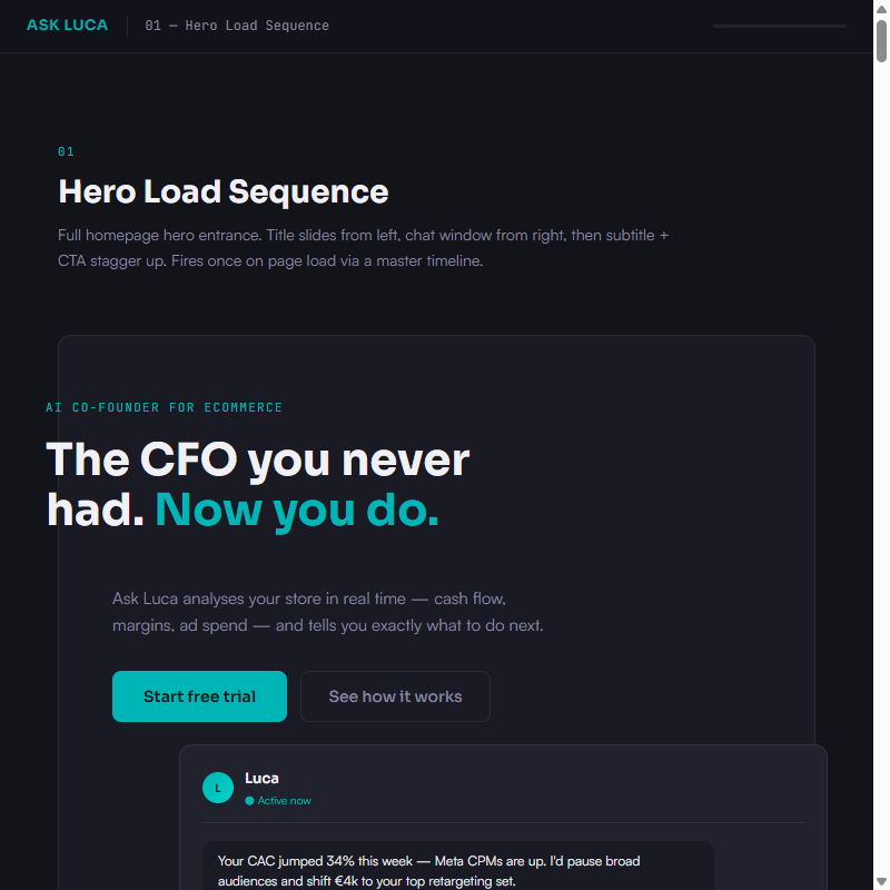
    Scroll-triggered and hover transitions, explored in a working demo file, pace the reading and cut how much text is on screen at once.

  3. Two engines, one card

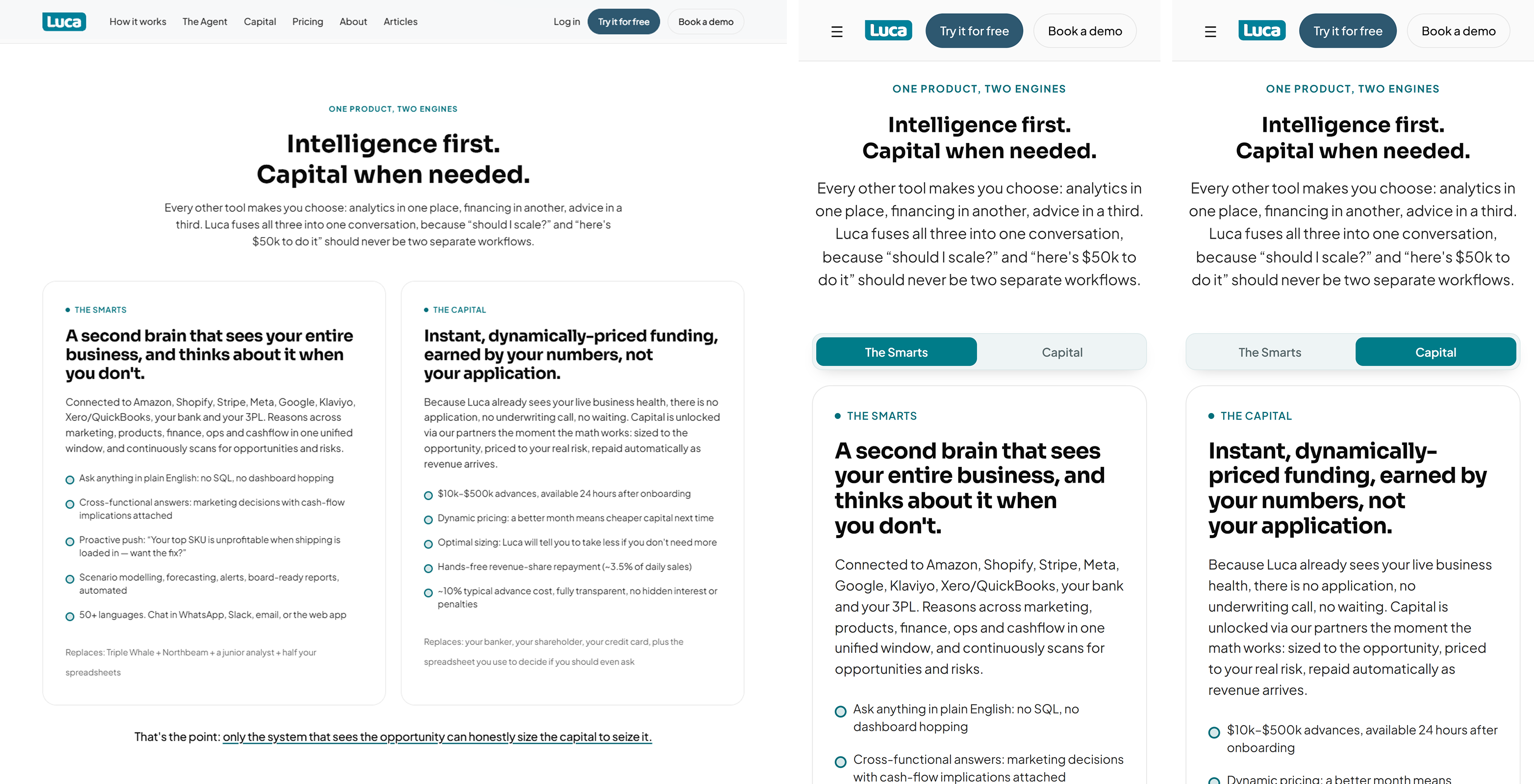
    The Smarts and The Capital sit side by side on a desktop, and share one card behind a segmented control on a phone.

  4. Capabilities as a chip rail

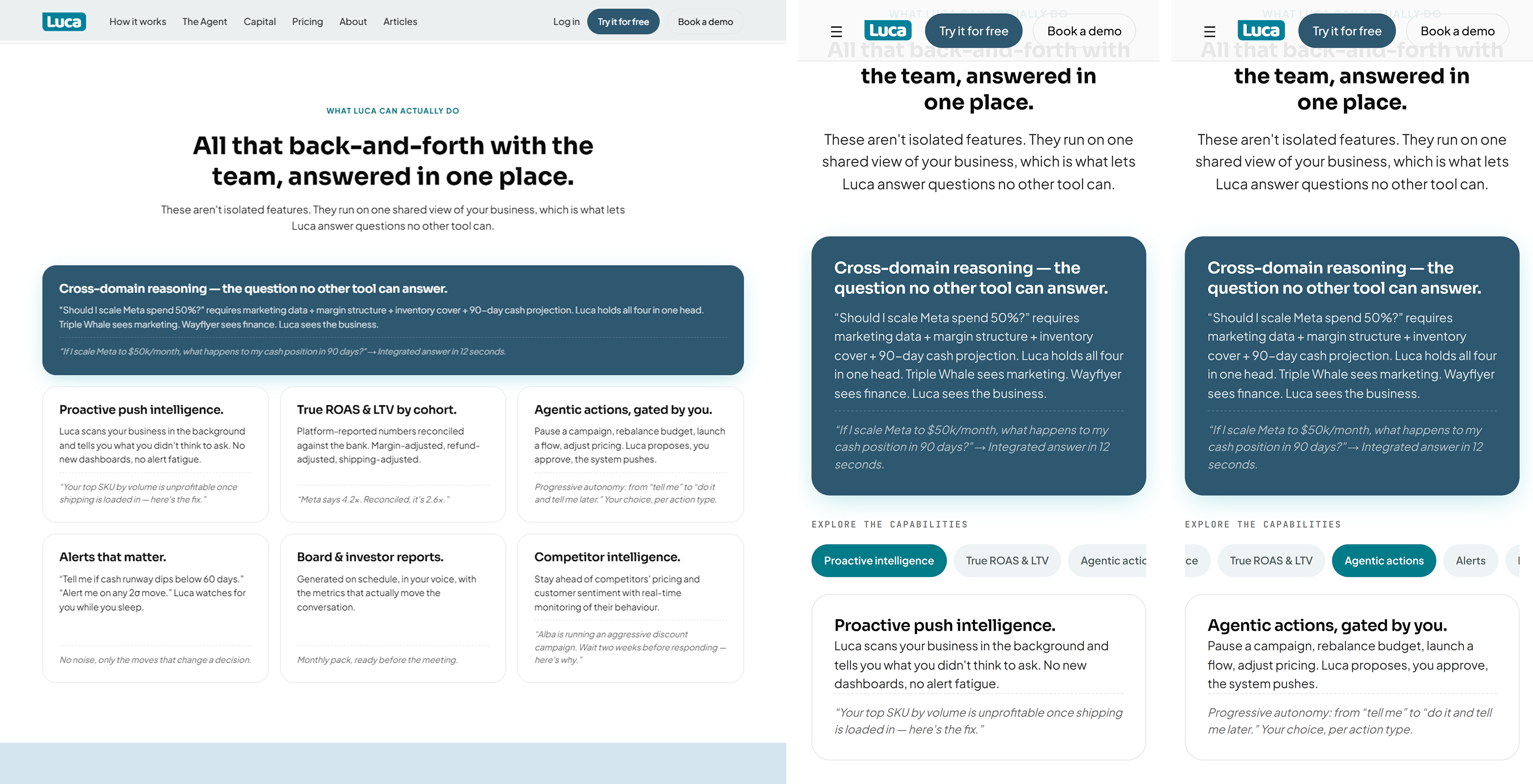
    Six capability cards in a grid become a scrolling rail of chips over a single card on a phone.

  5. Steps you swipe

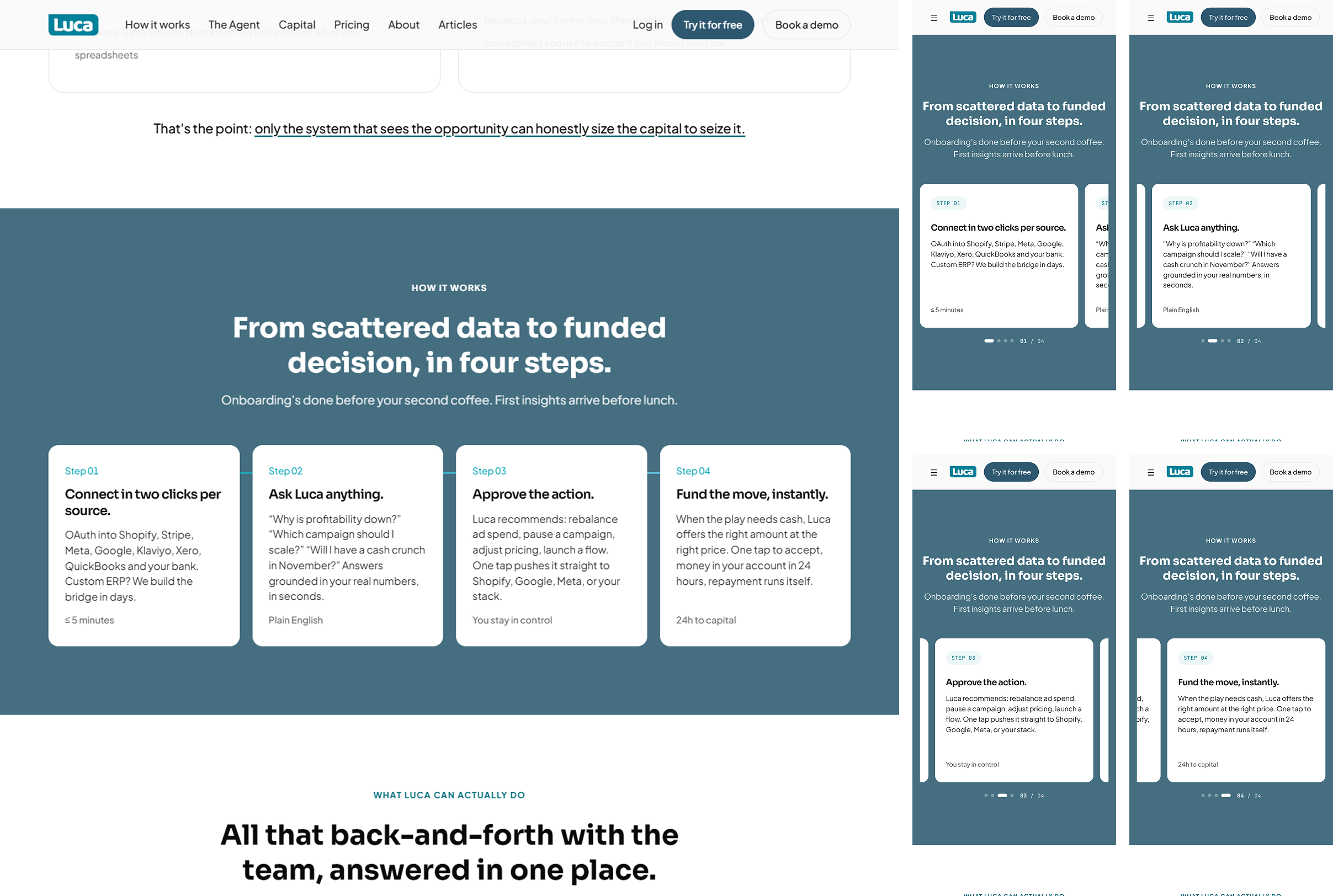
    The four steps run in one row on a desktop, and become a swipe carousel with a counter on a phone.

  6. A phone navigation sheet

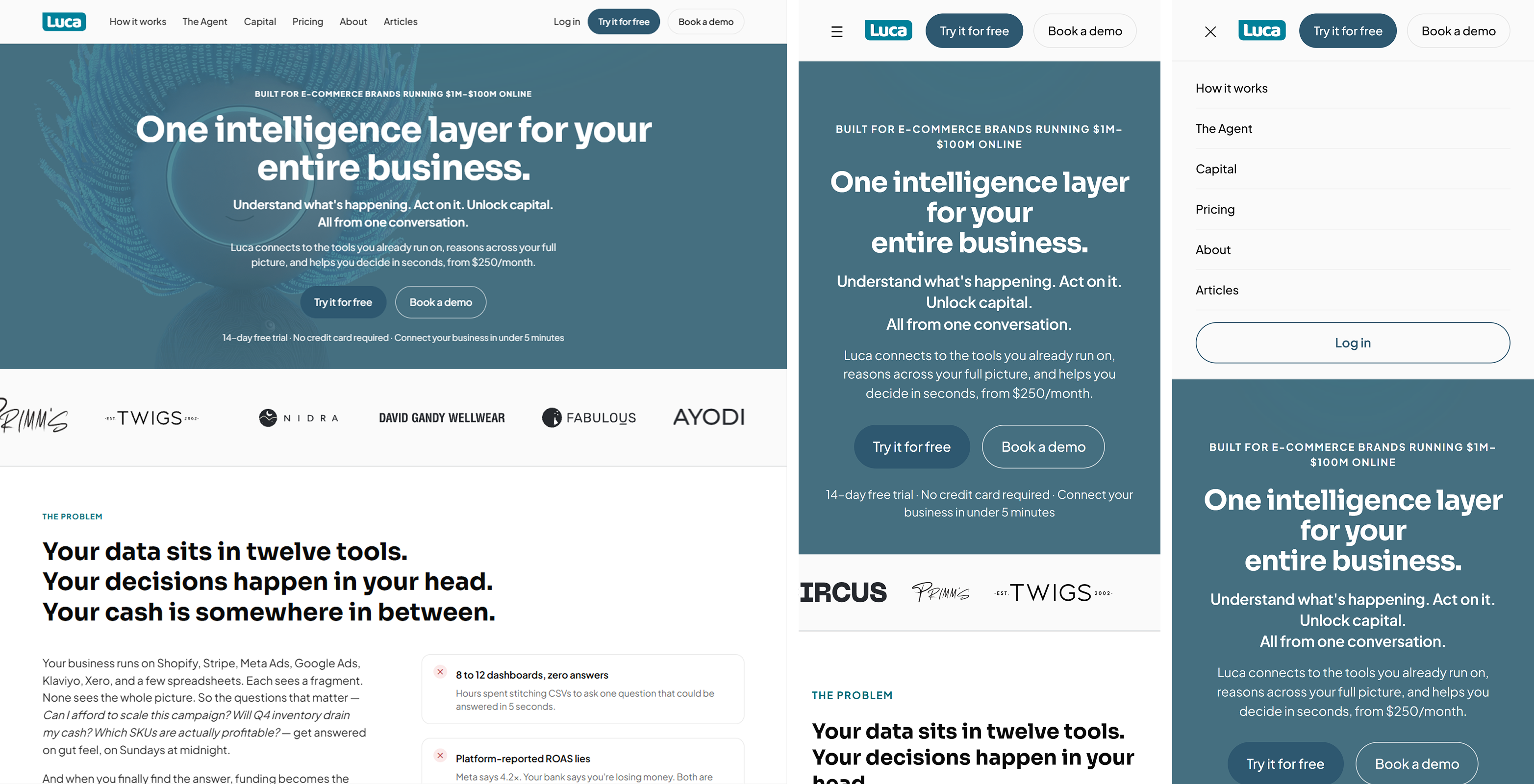
    On a phone the navigation opens as a sheet over the hero, instead of a desktop menu squeezed small.

  7. Native Webflow components

    Claude Code and Webflow’s MCP turned code mockups into Webflow-native components that work with CMS elements and respond cleanly.

  8. Editable without code

    The team edits copy and content in Webflow themselves, so the site does not wait on a designer or a developer.
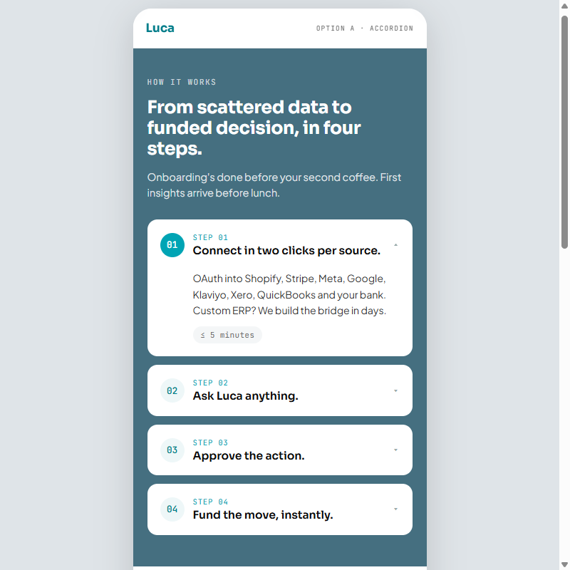
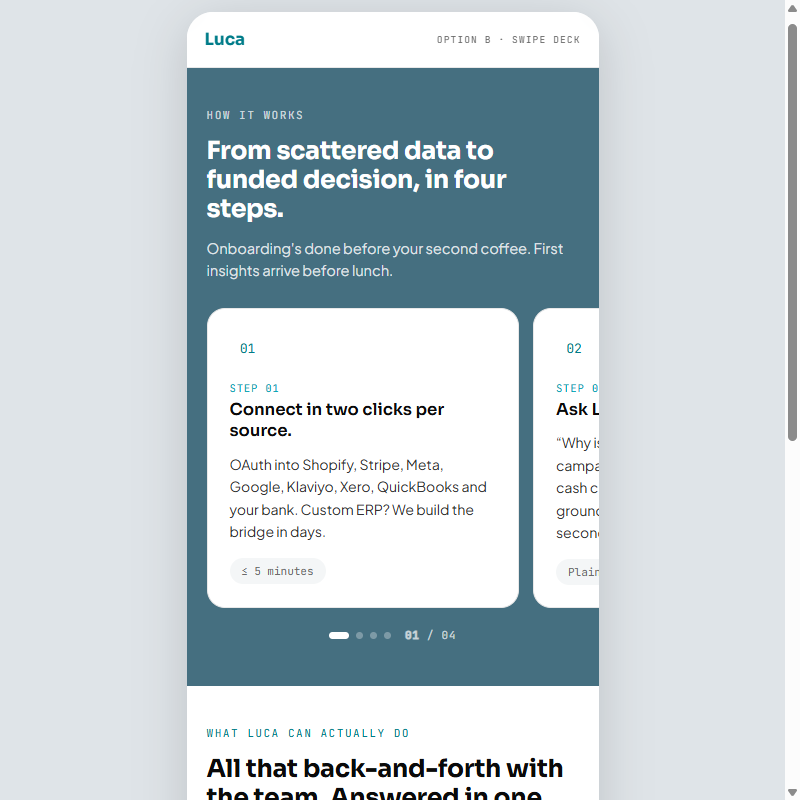
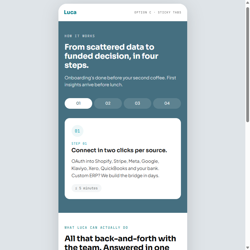
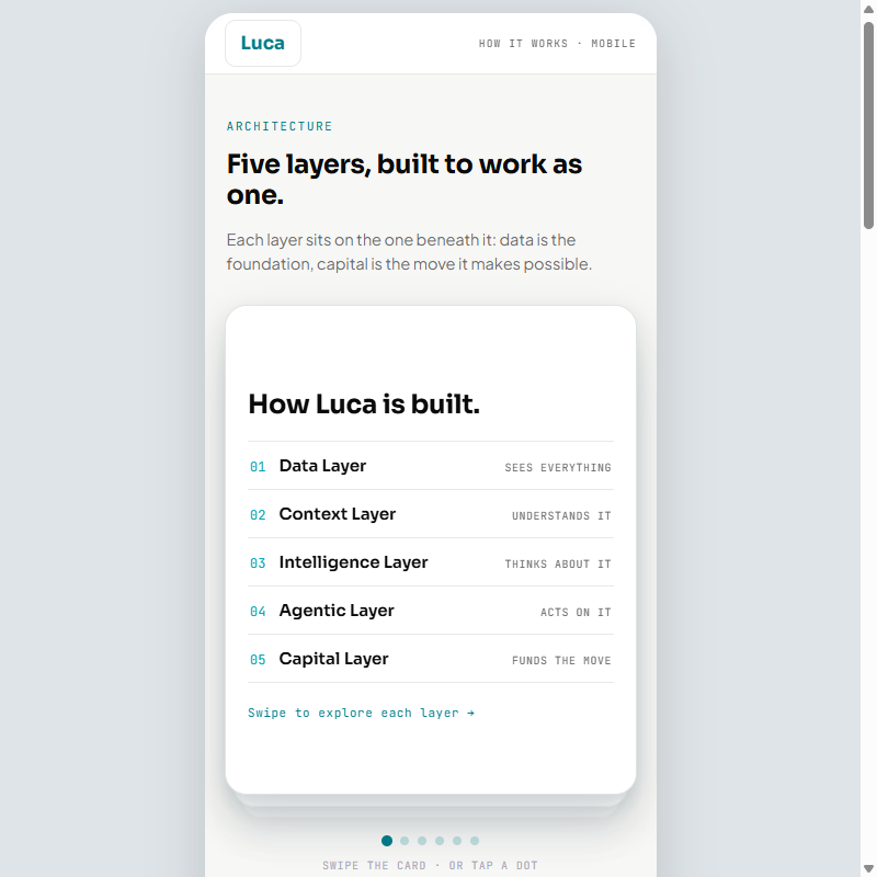
The motion explorer and four mobile concepts, built as working pages for rounds of feedback with Luca’s UX lead, its engineers and the CEO, until we landed on designs everyone agreed on

Final Deliverable
Reflection

Building the concepts as working pages instead of static frames changed the conversations around them. The CEO reacted to how a section actually moved on a phone rather than to my description of it, and choosing between an accordion, a swipe and tabs became a matter of trying all three.

Shipping through Claude Code and Webflow’s MCP moved me from handing designs off to putting them live, and it taught me that directing AI tools takes more precision, not less: exact hex values, typefaces and easing curves, or the tools make design decisions of their own. The payoff is a site the team has kept editing without me.

What I would do differently is measure before launch. With scroll depth and call-to-action clicks recorded on the old pages, the redesign could be judged against a baseline instead of by eye.

← All projects

Luca AI Website Redesign

Luca AI · UX Product Design Lead Intern · May – July 2026 · San Francisco Bay Area, CA (Remote)

Tools: Claude / Claude Code, Webflow + Webflow MCP, GSAP

  • Information Architecture
  • Visual Design
  • Front-End & No-Code Build
  • AI & SaaS
  • Marketing Website
The rebuilt Luca AI marketing site as it shipped.Full size (opens the file)

Make Luca AI’s text-heavy Webflow marketing site scannable on any screen without rewriting its AI-optimized copy, and ship it as native Webflow components the team can edit without code.

Context

The site’s copy was written for AI answer engines as much as for people, and largely fixed. The job: make the same words scannable on a desktop and a phone, as Webflow components the team could edit without code.

Read the full context

Luca AI’s marketing site carries a large body of AEO/GEO-optimized copy, written for AI crawlers and answer engines as much as for people, and that copy was largely fixed. The CEO handed me the front end of four pages — Homepage, How It Works, The Agent and Capital — for review. Even after a few passes there were real problems: mismatched calls to action, pricing that did not localize, sections several scrolls long, and testimonials on the Capital page with no attribution, which undercuts a product that runs on trust. The job was to make the same words scannable, on a desktop and on a phone. The site also runs on Webflow, which I had never used, and the team needed to keep editing it by hand after I left. So I had to learn Webflow itself, and then use Claude Code with Webflow’s MCP to turn my code mockups into native Webflow components, rather than embedded code that no one on the team could change.

Constraints

  1. Copy written for AI crawlers

    The text was optimized for answer engines and could barely change, so I worked with the external content specialist to clarify what each section was for, and changed structure and motion instead of words.

  2. Sections built for a desktop

    Several sections ran several scrolls long on a laptop alone, so each had to be restructured for a phone rather than shrunk to fit one.

  3. A team that would maintain it without me

    The site had to stay editable after I left, by people who do not write code, which ruled out a hand-coded build.

  4. An 8-hour time difference

    With a UK-based team, most of the collaboration happened asynchronously, through recordings, notes and daily updates.

Light
accent
accent-light
bg-base
bg-surface
bg-elevated
text-primary
text-secondary
text-muted
Dark
accent
accent-light
bg-base
bg-surface
bg-elevated
text-primary
text-secondary
text-muted
Type
For headings,Sora
For body text,Plus Jakarta Sans
Buttons
primary
secondary
ghost
icon
destructive
Motion
80mslinearduration-instant
150msease-outduration-fast
220msease-in-outduration-base
300mscubic-bezier(.16,1,.3,1)duration-enter
500mscubic-bezier(.22,1,.36,1)duration-complex
The style foundation the site’s colors, type and motion came from

Key Features

  1. Consistency first

    Mismatched calls to action and other inconsistencies were fixed and cleared with the CEO before any layout work began.

  2. A motion language

    Scroll-triggered and hover transitions, explored in a working demo file, pace the reading and cut how much text is on screen at once.

  3. Two engines, one card

    The Smarts and The Capital sit side by side on a desktop, and share one card behind a segmented control on a phone.

  4. Capabilities as a chip rail

    Six capability cards in a grid become a scrolling rail of chips over a single card on a phone.

  5. Steps you swipe

    The four steps run in one row on a desktop, and become a swipe carousel with a counter on a phone.

  6. A phone navigation sheet

    On a phone the navigation opens as a sheet over the hero, instead of a desktop menu squeezed small.

  7. Native Webflow components

    Claude Code and Webflow’s MCP turned code mockups into Webflow-native components that work with CMS elements and respond cleanly.

  8. Editable without code

    The team edits copy and content in Webflow themselves, so the site does not wait on a designer or a developer.

The animation explorer: ten scroll and hover transitions, one per panel.
The animation explorer: a fixed sidebar of ten numbered sections beside full-height panels, each demonstrating one scroll-triggered or hover transition from the motion system.Open demo (opens in a new tab) ↗
Mobile concept A: accordion rows.
Mobile concept A: the how-it-works steps and the capability set as stacked accordion rows, expanding one at a time inside a phone frame.Open demo (opens in a new tab) ↗
Concept B: swiped decks.
Mobile concept B: the same two sections as horizontally swiped decks, one card filling the frame with the next peeking in at the edge.Open demo (opens in a new tab) ↗
Concept C: sticky tab bars.
Mobile concept C: the same two sections behind sticky tab bars that pin under the header as the content scrolls past.Open demo (opens in a new tab) ↗
How It Works on a phone: three draggable tabbed panels.
A mobile concept for the How It Works page: Architecture, End-to-end and Integrations as three draggable tabbed panels.Open demo (opens in a new tab) ↗

The motion explorer and four mobile concepts, built as working pages for rounds of feedback with Luca’s UX lead, its engineers and the CEO, until we landed on designs everyone agreed on

Final Deliverable
The shipped homepage hero on a phone.
The shipped homepage, desktop beside two phones: the wide teal hero over a customer-logo strip and the opening of The Problem, then the same hero on a phone, then the phone with its navigation sheet open over the hero.Cropped · full image (opens the whole file)
The navigation opens as a sheet over the hero.
The shipped homepage, desktop beside two phones: the wide teal hero over a customer-logo strip and the opening of The Problem, then the same hero on a phone, then the phone with its navigation sheet open over the hero.Cropped · full image (opens the whole file)
On a desktop, The Smarts and The Capital sit side by side…
The two-engine section, desktop beside two phones: The Smarts and The Capital sit as side-by-side cards on desktop, while on mobile they share one card behind a segmented control — shown once with The Smarts selected and once with Capital.Cropped · full image (opens the whole file)
…on a phone they share one card behind a segmented control.
The two-engine section, desktop beside two phones: The Smarts and The Capital sit as side-by-side cards on desktop, while on mobile they share one card behind a segmented control — shown once with The Smarts selected and once with Capital.Cropped · full image (opens the whole file)
Six capability cards in a grid on a desktop…
The capability section, desktop beside two phones: six cards in a three-by-two grid on desktop become a scrolling chip rail over a single card on mobile — shown once at the start of the rail and once scrolled along it, with a chip clipped at each edge.Cropped · full image (opens the whole file)
…become a rail of chips over a single card on a phone.
The capability section, desktop beside two phones: six cards in a three-by-two grid on desktop become a scrolling chip rail over a single card on mobile — shown once at the start of the rail and once scrolled along it, with a chip clipped at each edge.Cropped · full image (opens the whole file)
The four steps in one row on a desktop…
The four-step section, desktop beside four phones: the steps run across in a single row on desktop, while the phones show the same four steps one at a time as a swipe carousel, its counter reading 01 through 04.Cropped · full image (opens the whole file)
…and as a swipe carousel with a counter on a phone.
The four-step section, desktop beside four phones: the steps run across in a single row on desktop, while the phones show the same four steps one at a time as a swipe carousel, its counter reading 01 through 04.Cropped · full image (opens the whole file)

Reflection

Working pages changed the conversations around the concepts; shipping through Claude Code and Webflow’s MCP taught me that directing AI tools takes more precision, not less.

Read the full reflection

Building the concepts as working pages instead of static frames changed the conversations around them. The CEO reacted to how a section actually moved on a phone rather than to my description of it, and choosing between an accordion, a swipe and tabs became a matter of trying all three.

Shipping through Claude Code and Webflow’s MCP moved me from handing designs off to putting them live, and it taught me that directing AI tools takes more precision, not less: exact hex values, typefaces and easing curves, or the tools make design decisions of their own. The payoff is a site the team has kept editing without me.

What I would do differently is measure before launch. With scroll depth and call-to-action clicks recorded on the old pages, the redesign could be judged against a baseline instead of by eye.

  • Information Architecture
  • Visual Design
  • Front-End & No-Code Build
  • AI & SaaS
  • Marketing Website
← All projects