Dante
Garetto
← All projects

Luca AI Business Snapshot + Push Emails Redesign

My Role
UX Product Design Lead Intern
Location
San Francisco Bay Area, CA (Remote)
Tools
  • Figma
  • Claude / Claude Code
  • Figma Make
Timeline
2-3 weeksMay – July 2026
Tags
  • Visual Design
  • Design Systems
  • Information Architecture
  • AI & SaaS
  • Email & Notifications

What

Turn Luca AI’s plain-text push emails into a scannable, color-coded notification system that gets founders from their inbox to a decision at a glance.

Context

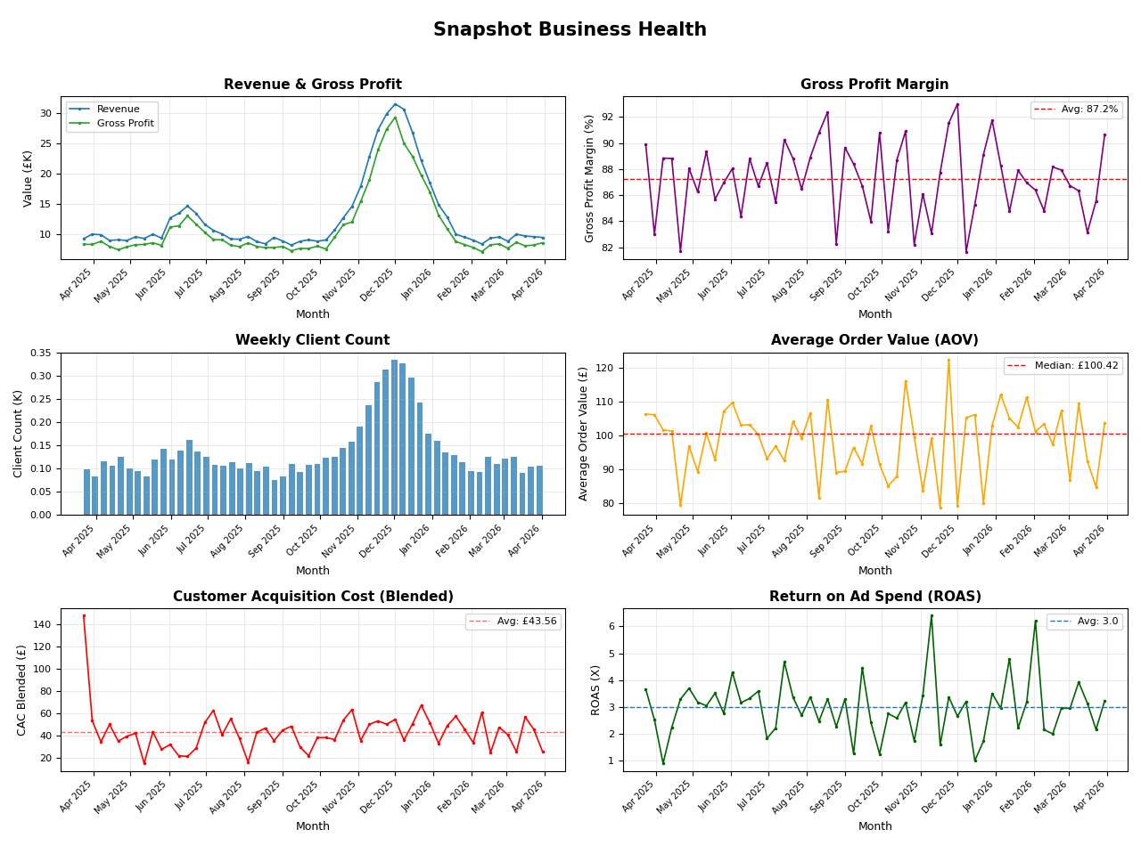
Luca AI sends two kinds of push email: a short Insight, and a Weekly Business Report carrying four insights, week-on-week metrics and a Business Health Snapshot PDF charting the same metrics over a year. Both were near-plain-text messages with a single button: every line the same size, no headings, and color coding too faint to register. The information meant to bring founders back into the product read like spam, and was the easiest thing in the inbox to ignore.
The originals, shown with sample data

Constraints

  1. Built on the existing mailing system. I worked outward from what the backend engineers had already implemented, so every component had to be something the system could actually send.
  2. No design system to inherit. Luca had a handful of hex codes and nothing else, so I first set down a basic system — color, type and spacing — and built every email component from scratch on top of it, staying true to a brand that was already live.
  3. All of the content had to stay. Four insights, seven week-on-week metrics and the Business Health Snapshot are what the report is for; the redesign could reorganize them, not cut them.
  4. An 8-hour time difference. With a UK-based team, most of the collaboration happened asynchronously, through recordings, notes and daily updates.
  5. No access to users. US clients did not respond to interview requests, and the time difference made sessions with EU clients hard to schedule, so the redesign rests on the existing emails and reasoning rather than on interviews.
Light
accent
accent-light
bg-base
bg-surface
bg-elevated
text-primary
text-secondary
text-muted
Dark
accent
accent-light
bg-base
bg-surface
bg-elevated
text-primary
text-secondary
text-muted
Type
For headings,Sora
For body text,Plus Jakarta Sans
Buttons
primary
secondary
ghost
icon
destructive
Motion
80mslinearduration-instant
150msease-outduration-fast
220msease-in-outduration-base
300mscubic-bezier(.16,1,.3,1)duration-enter
500mscubic-bezier(.22,1,.36,1)duration-complex
The style foundation every email component was built on

Key Features

  1. Origin at a glance

    The Luca logo and an email-type label open every message, so a reader knows what it is before reading a word.

  2. A contained headline

    The headline and a short description sit in their own lighter card, set apart from everything below.

  3. Metrics in pairs

    Two metric cards side by side, so a number arrives with a related or contrasting figure that gives it context.

  4. A suggestion, not just a problem

    Each insight ends with a short proposed fix, and one button into Luca for the full breakdown.

  5. Color-coded insights

    The weekly report’s four insights are coded by tone, so good news and warnings separate before they are read.

  6. The CTA above the fold

    The main call to action moved up beside the headline summary, visible without scrolling.

  7. Metrics as cards

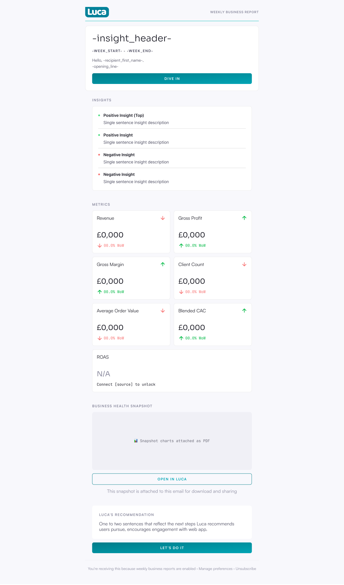
    The week-on-week metrics became a grid of cards instead of a plain-text list, with the Business Health Snapshot kept.

  8. Three ways in

    Separate buttons open a Luca conversation on the insight, the metrics or the solution — three angles on one report.

Final Deliverable

Reflection

Designing inside a system that already existed made the backend engineers my first users: grounding every idea in what the mailer could already send is what let the redesign ship, rather than stall as a concept. Using Claude to generate quick mockups let me test components before committing to them, and kept my focus on general design decision making over individual pixels.

What I would do differently is find stand-in users rather than wait on Luca’s own. I would network my way to founders of small eCommerce companies — the market Luca is built for, and the kind of business its current users run — and test the emails with them before committing to a layout. As it stands, the “digestible at a glance” principle rests on reasoning more than on research; now that the system is live, open and click-through rates are the evidence I would want to see.

The foundation these emails were built on covered little beyond color, type and spacing. I am currently taking an advanced interaction design class where we build a design system from the ground up for a brand and applying said learning to future projects

← All projects

Luca AI Business Snapshot + Push Emails Redesign

Luca AI · UX Product Design Lead Intern · May – July 2026 · San Francisco Bay Area, CA (Remote)

Tools: Figma, Claude / Claude Code, Figma Make

  • Visual Design
  • Design Systems
  • Information Architecture
  • AI & SaaS
  • Email & Notifications
Three redesigned Luca AI push-email templates side by side.Full size (opens the file)

Turn Luca AI’s plain-text push emails into a scannable, color-coded notification system that gets founders from their inbox to a decision at a glance.

Context

Luca’s Insight and Weekly Business Report emails were near-plain-text with a single button: every line the same size, no headings, colour coding too faint to register. They read like spam.

Read the full context

Luca AI sends two kinds of push email: a short Insight, and a Weekly Business Report carrying four insights, week-on-week metrics and a Business Health Snapshot PDF charting the same metrics over a year. Both were near-plain-text messages with a single button: every line the same size, no headings, and color coding too faint to register. The information meant to bring founders back into the product read like spam, and was the easiest thing in the inbox to ignore.
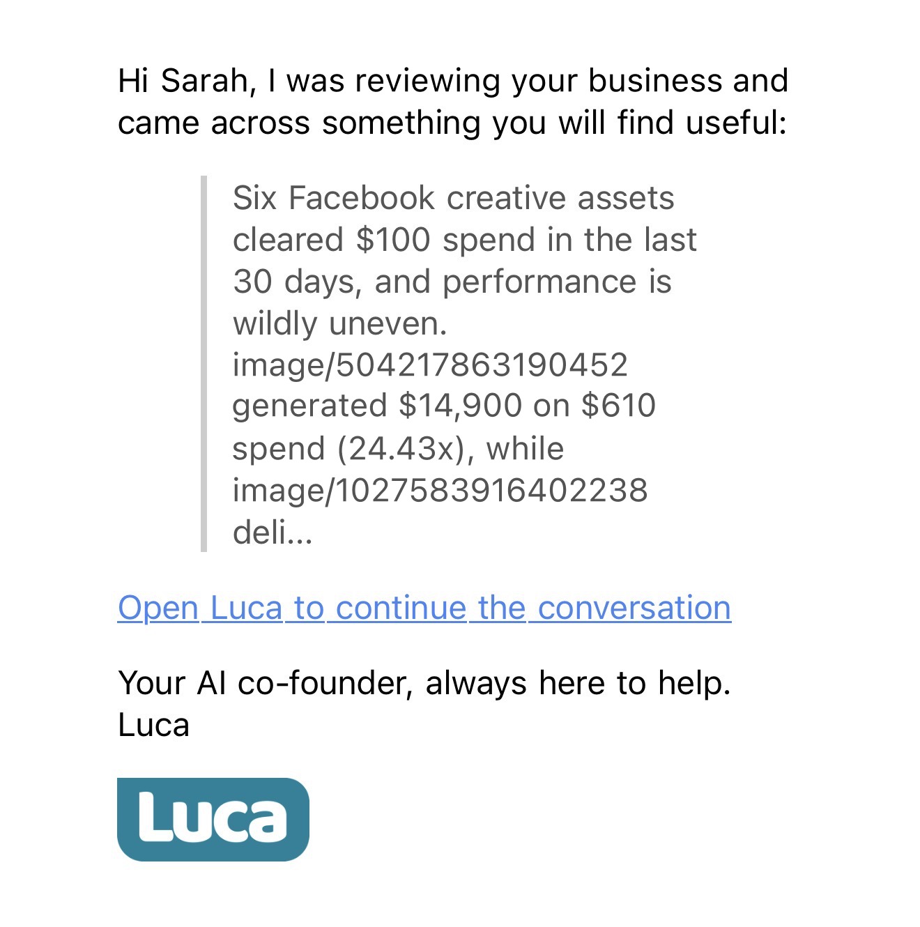
The original Insight email: one grey paragraph, cut off mid-word, and a plain link.
The original Luca Insight email on a phone, shown with sample data: a greeting, one grey quoted paragraph cut off mid-word, a plain underlined link to open Luca, and the sign-off.Full size (opens the file)
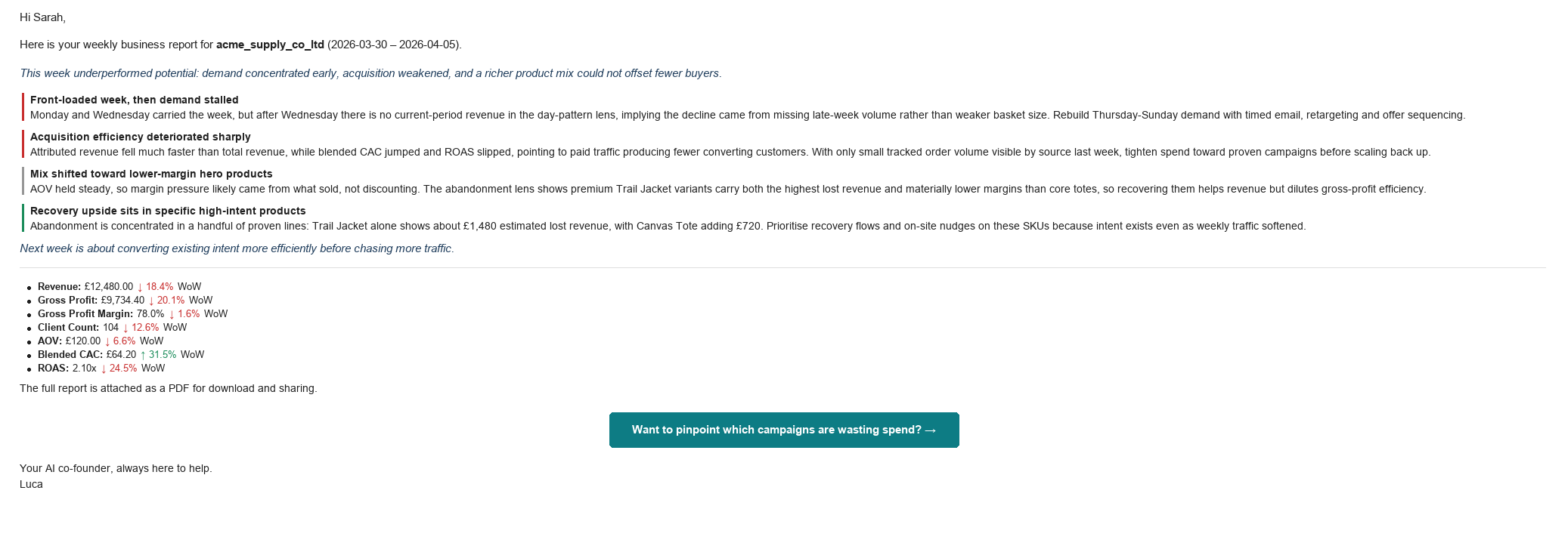
The original Weekly Business Report: insights marked only by thin coloured bars, metrics as a plain list.
The original Weekly Business Report email, shown with sample data: an italic summary, four insight paragraphs marked only by thin coloured bars, a bulleted list of week-on-week metrics, and one call-to-action button at the bottom.Cropped · full image (opens the whole file)
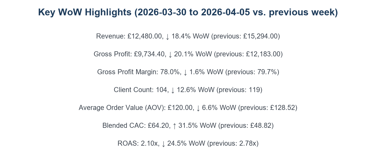
The attached PDF: seven metrics as centred lines of plain text.
Page one of the attached PDF, shown with sample data: Key WoW Highlights, seven metrics as centred lines of plain text with previous-week values in brackets.Cropped · full image (opens the whole file)
Its second page: six default-styled charts.
Page two of the attached PDF, the Business Health Snapshot: six default-styled line and bar charts of sample revenue, margin, client count, order value, acquisition cost and return on ad spend.Full size (opens the file)

The originals, shown with sample data

Constraints

  1. Built on the existing mailing system

    I worked outward from what the backend engineers had already implemented, so every component had to be something the system could actually send.

  2. No design system to inherit

    Luca had a handful of hex codes and nothing else, so I first set down a basic system — color, type and spacing — and built every email component from scratch on top of it, staying true to a brand that was already live.

  3. All of the content had to stay

    Four insights, seven week-on-week metrics and the Business Health Snapshot are what the report is for; the redesign could reorganize them, not cut them.

  4. An 8-hour time difference

    With a UK-based team, most of the collaboration happened asynchronously, through recordings, notes and daily updates.

  5. No access to users

    US clients did not respond to interview requests, and the time difference made sessions with EU clients hard to schedule, so the redesign rests on the existing emails and reasoning rather than on interviews.

Light
accent
accent-light
bg-base
bg-surface
bg-elevated
text-primary
text-secondary
text-muted
Dark
accent
accent-light
bg-base
bg-surface
bg-elevated
text-primary
text-secondary
text-muted
Type
For headings,Sora
For body text,Plus Jakarta Sans
Buttons
primary
secondary
ghost
icon
destructive
Motion
80mslinearduration-instant
150msease-outduration-fast
220msease-in-outduration-base
300mscubic-bezier(.16,1,.3,1)duration-enter
500mscubic-bezier(.22,1,.36,1)duration-complex
The style foundation every email component was built on

Key Features

  1. Origin at a glance

    The Luca logo and an email-type label open every message, so a reader knows what it is before reading a word.

  2. A contained headline

    The headline and a short description sit in their own lighter card, set apart from everything below.

  3. Metrics in pairs

    Two metric cards side by side, so a number arrives with a related or contrasting figure that gives it context.

  4. A suggestion, not just a problem

    Each insight ends with a short proposed fix, and one button into Luca for the full breakdown.

  5. Color-coded insights

    The weekly report’s four insights are coded by tone, so good news and warnings separate before they are read.

  6. The CTA above the fold

    The main call to action moved up beside the headline summary, visible without scrolling.

  7. Metrics as cards

    The week-on-week metrics became a grid of cards instead of a plain-text list, with the Business Health Snapshot kept.

  8. Three ways in

    Separate buttons open a Luca conversation on the insight, the metrics or the solution — three angles on one report.

Final Deliverable
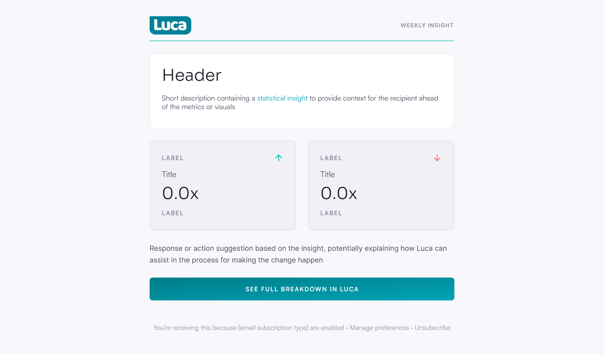
The redesigned Insight: logo and label on top, the headline in its own card, metrics in pairs, a suggested fix, one button.
The redesigned Insight email: the Luca wordmark opposite a ‘Weekly Insight’ label, a white card holding a headline and short description, two side-by-side metric cards with trend arrows, a suggestion line, and a full-width teal ‘See full breakdown in Luca’ button.Cropped · full image (opens the whole file)
The redesigned Weekly Business Report: the CTA up beside the summary, insights color-coded by tone, metrics as cards, the Snapshot kept.
The redesigned Weekly Business Report: a header card carrying the summary and a ‘Dive in’ button, four color-dotted insights, seven metric cards in a two-column grid, a Business Health Snapshot block with an ‘Open in Luca’ button, and a recommendation card with its own button.Cropped · full image (opens the whole file)

Reflection

Designing inside what the mailer could already send is what let it ship; next time I would find stand-in founders to test with.

Read the full reflection

Designing inside a system that already existed made the backend engineers my first users: grounding every idea in what the mailer could already send is what let the redesign ship, rather than stall as a concept. Using Claude to generate quick mockups let me test components before committing to them, and kept my focus on general design decision making over individual pixels.

What I would do differently is find stand-in users rather than wait on Luca’s own. I would network my way to founders of small eCommerce companies — the market Luca is built for, and the kind of business its current users run — and test the emails with them before committing to a layout. As it stands, the “digestible at a glance” principle rests on reasoning more than on research; now that the system is live, open and click-through rates are the evidence I would want to see.

The foundation these emails were built on covered little beyond color, type and spacing. I am currently taking an advanced interaction design class where we build a design system from the ground up for a brand and applying said learning to future projects

  • Visual Design
  • Design Systems
  • Information Architecture
  • AI & SaaS
  • Email & Notifications
← All projects