Dante
Garetto
← All projects

Luca AI Web Application Redesign

My Role
UX Product Design Lead Intern
Location
San Francisco Bay Area, CA (Remote)
Tools
  • Figma
Timeline
May – July 2026
Tags
  • UX Audit
  • Interaction Design
  • Prototyping
  • AI & SaaS
  • Web App

What

Redesign Luca AI’s chat web app so a busy founder can find a past conversation, see what needs attention, and read an answer without scrolling through it.

Context

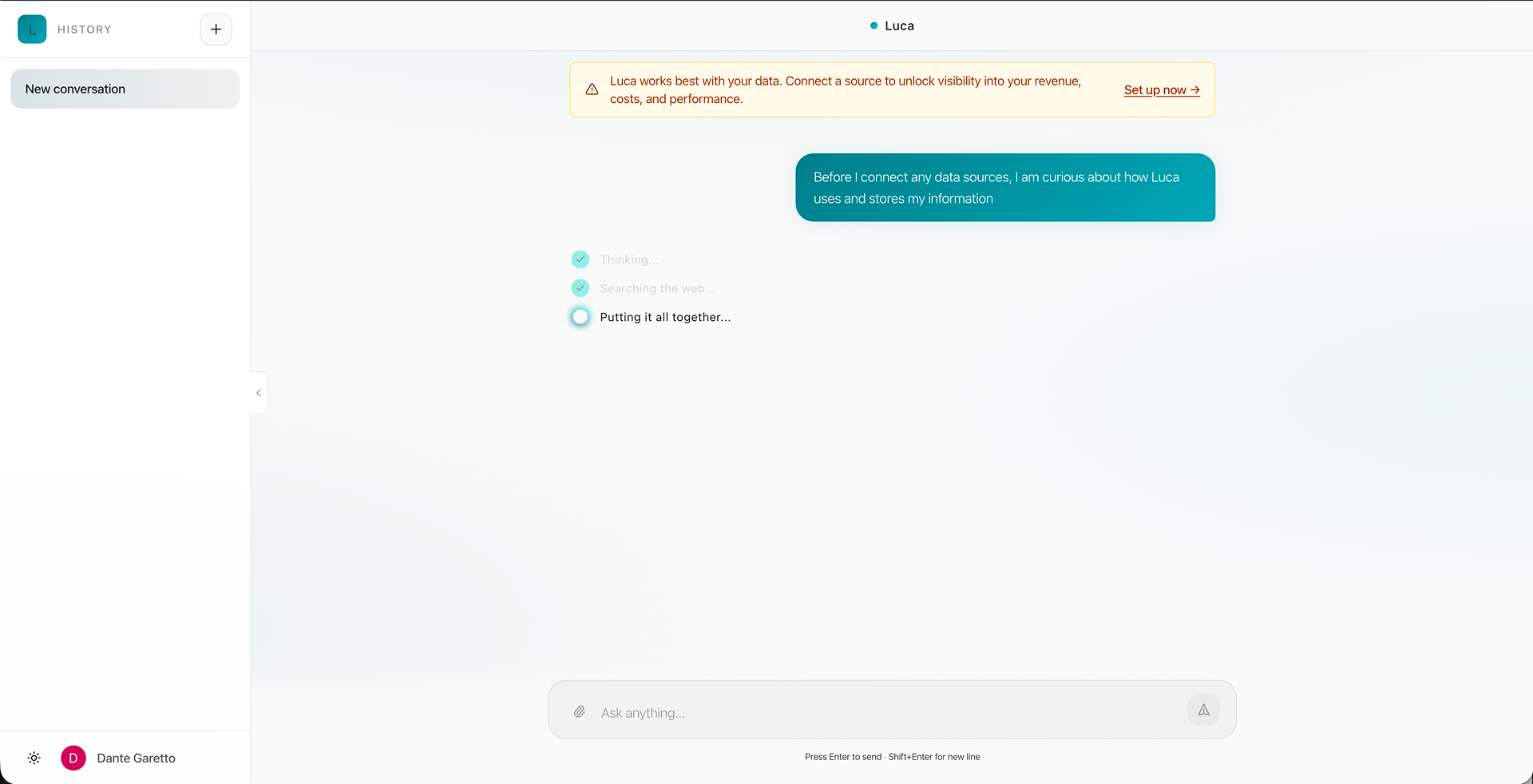
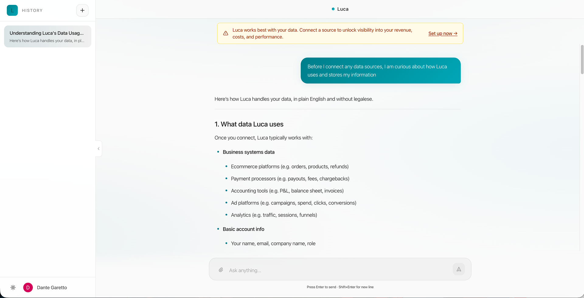
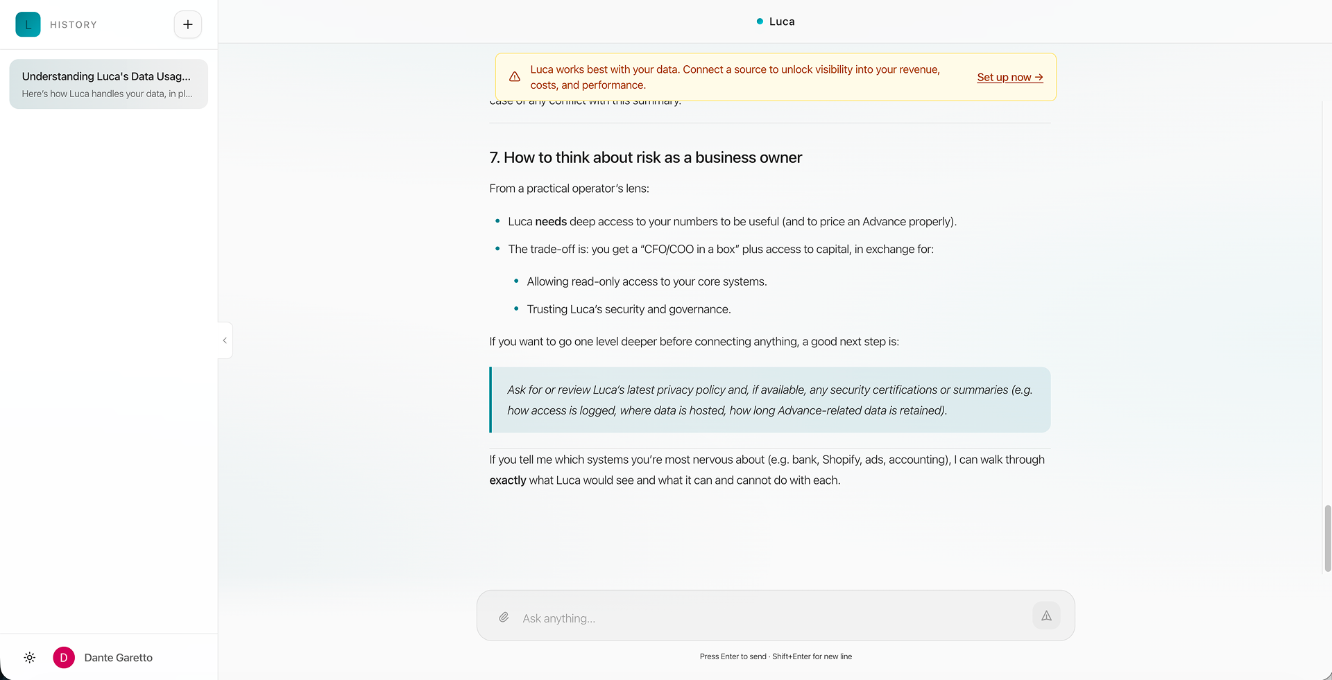
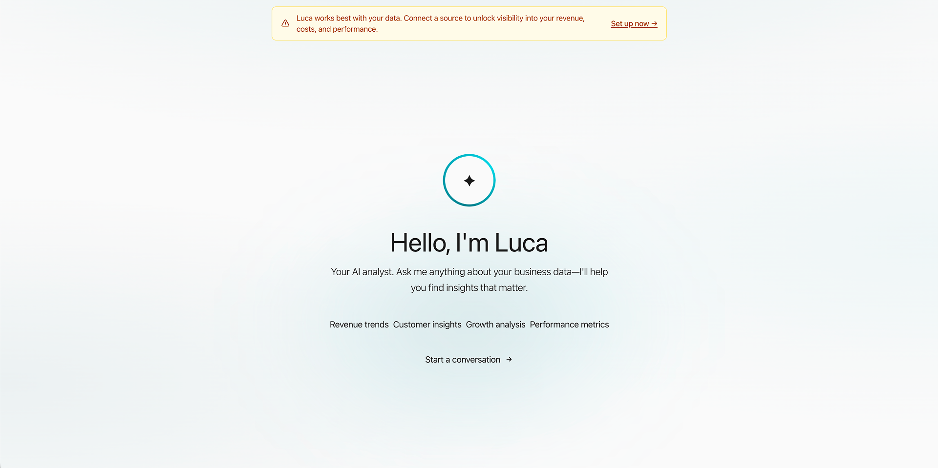
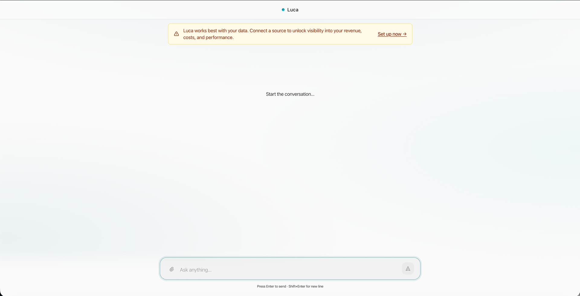
Luca AI’s web app is a chat interface where founders ask an AI co-founder about their business. Its side menu was a bare history list, with no way to organize or search chats for a user with unlimited questions and limited time. A landing page stood in front of the chat as an unnecessary cover, and status lines like ‘Putting it all together…’ raised more questions than they answered. Responses were long, text-only and double-spaced — one question produced seven sections — and loaded scrolled to the end, sending the reader back up to the top to start.
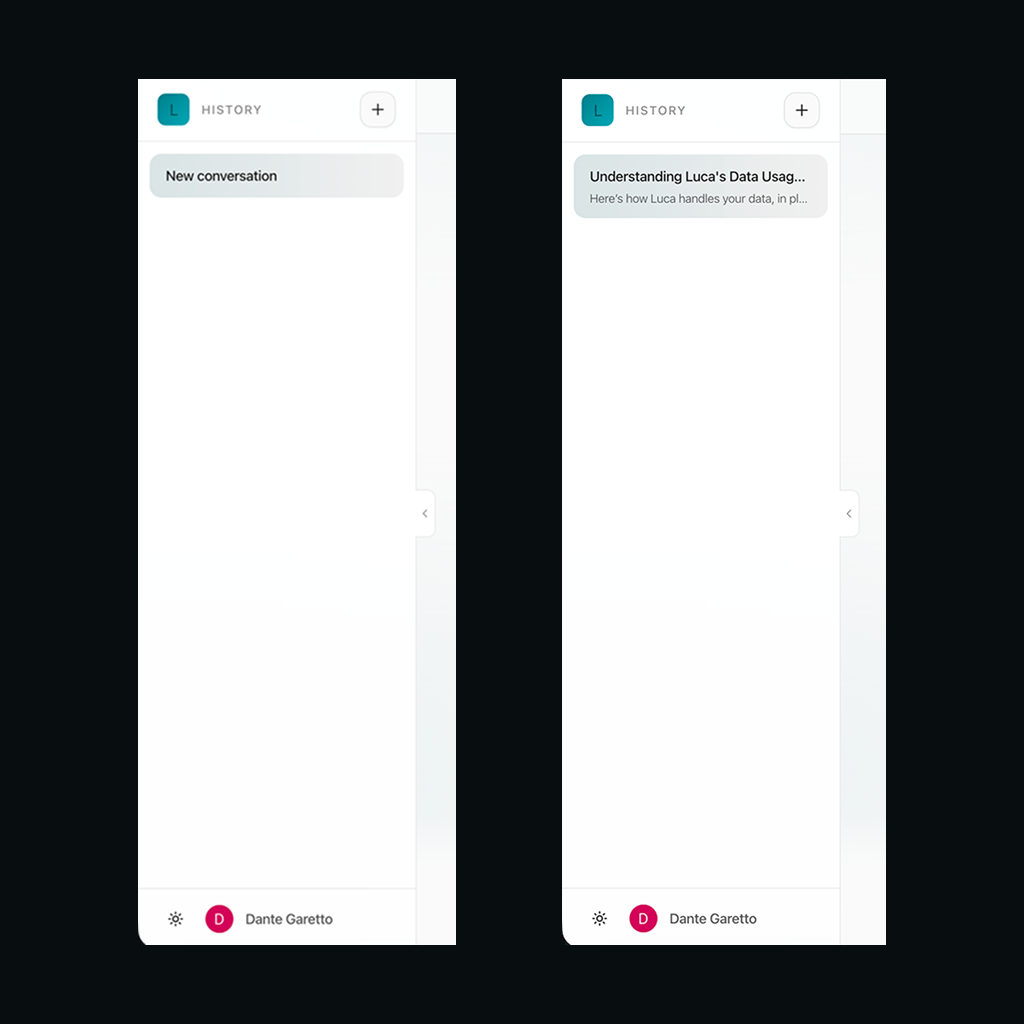
The original app screens

Constraints

  1. Founders short on time. Users could ask Luca anything, as often as they liked, but had little time to sift through the answers — so every screen had to get to the point.
  2. A product that was already shipped. New ideas had to be balanced against the app’s existing function and a brand its users already knew.
  3. No design system to inherit. Beyond a handful of hex codes there was nothing to build from, so I first set down a basic system — color, type and spacing — and designed each component from scratch on top of it.
  4. An 8-hour time difference. With a UK-based team, most of the collaboration happened asynchronously, through recordings, notes and daily updates.
  5. No access to users. US clients did not respond to interview requests, and the time difference made sessions with EU clients hard to schedule, so the redesign rests on competitor patterns and reasoning rather than on interviews.
Light
accent
accent-light
bg-base
bg-surface
bg-elevated
text-primary
text-secondary
text-muted
Dark
accent
accent-light
bg-base
bg-surface
bg-elevated
text-primary
text-secondary
text-muted
Type
For headings,Sora
For body text,Plus Jakarta Sans
Buttons
primary
secondary
ghost
icon
destructive
Motion
80mslinearduration-instant
150msease-outduration-fast
220msease-in-outduration-base
300mscubic-bezier(.16,1,.3,1)duration-enter
500mscubic-bezier(.22,1,.36,1)duration-complex
The style foundation every screen was built on

Key Features

  1. Folders and chat search

    Chats can be organized into folders and found by search, instead of scrolled for in one long history.

  2. Recents within reach

    A recents section keeps the chats a user returns to most one click away.

  3. One place for settings

    The profile section at the foot of the menu follows the familiar LLM pattern, and holds both user and business settings.

  4. Check-in cards

    The landing opens on insight cards color-coded by priority, each with a ‘Go to chat’ link, so a founder sees what needs attention first.

  5. Context before the question

    A row of buttons sets context before a prompt is written, so it does not have to be typed into every one.

  6. Progress you can see

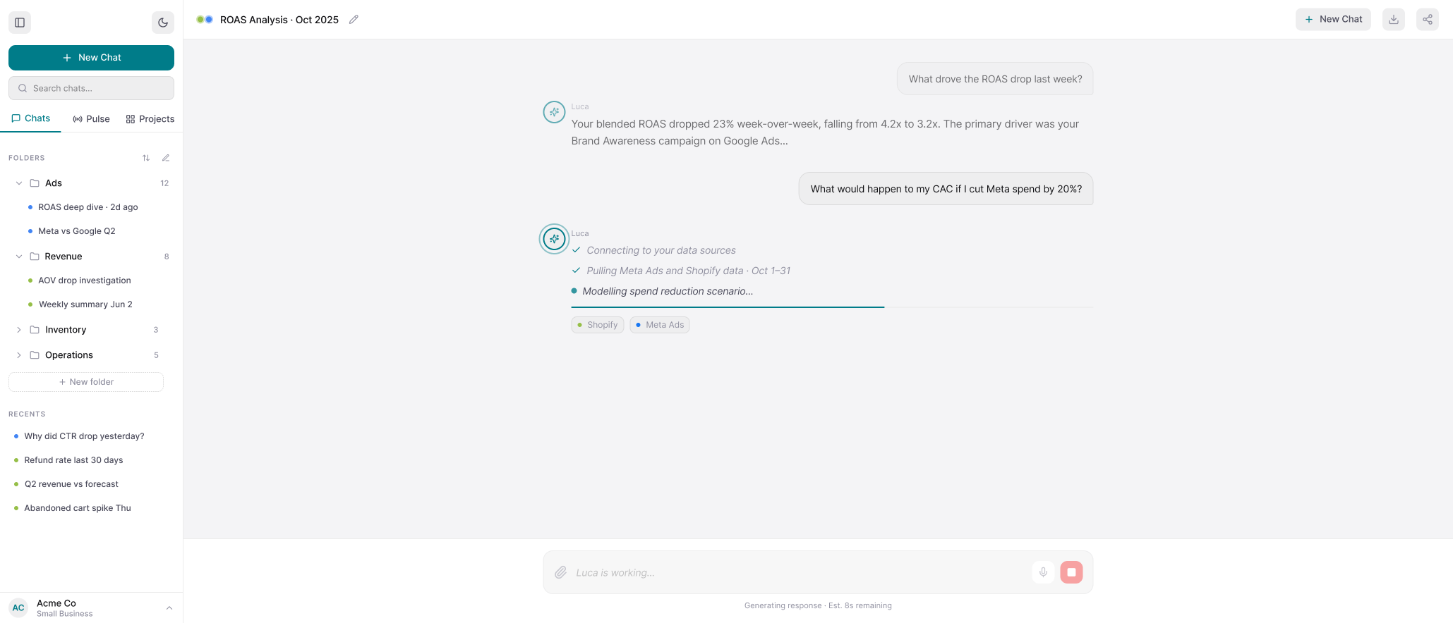
    The endless loading loop became a progress bar, keeping the step-by-step checkmarks.

  7. Sources on every step

    Each step names the data source Luca is pulling from, giving oversight and a place to start troubleshooting a wrong answer.

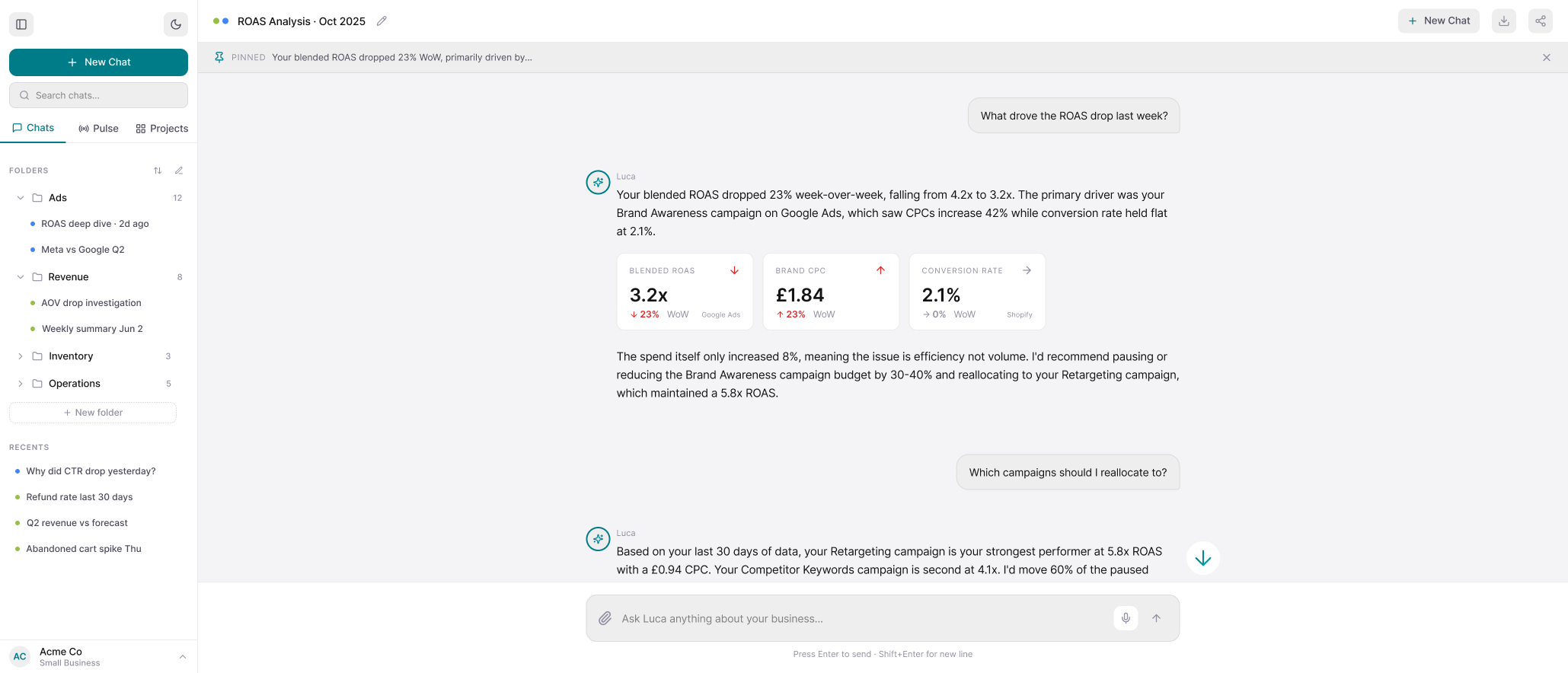
  8. Answers as cards

    Metric cards show a trend at a glance, as a number and in context, with its source — so an answer needs little or no scrolling.

  9. Jump to latest, on request

    An arrow beside the chat jumps to the newest response, instead of the page jumping there on load.

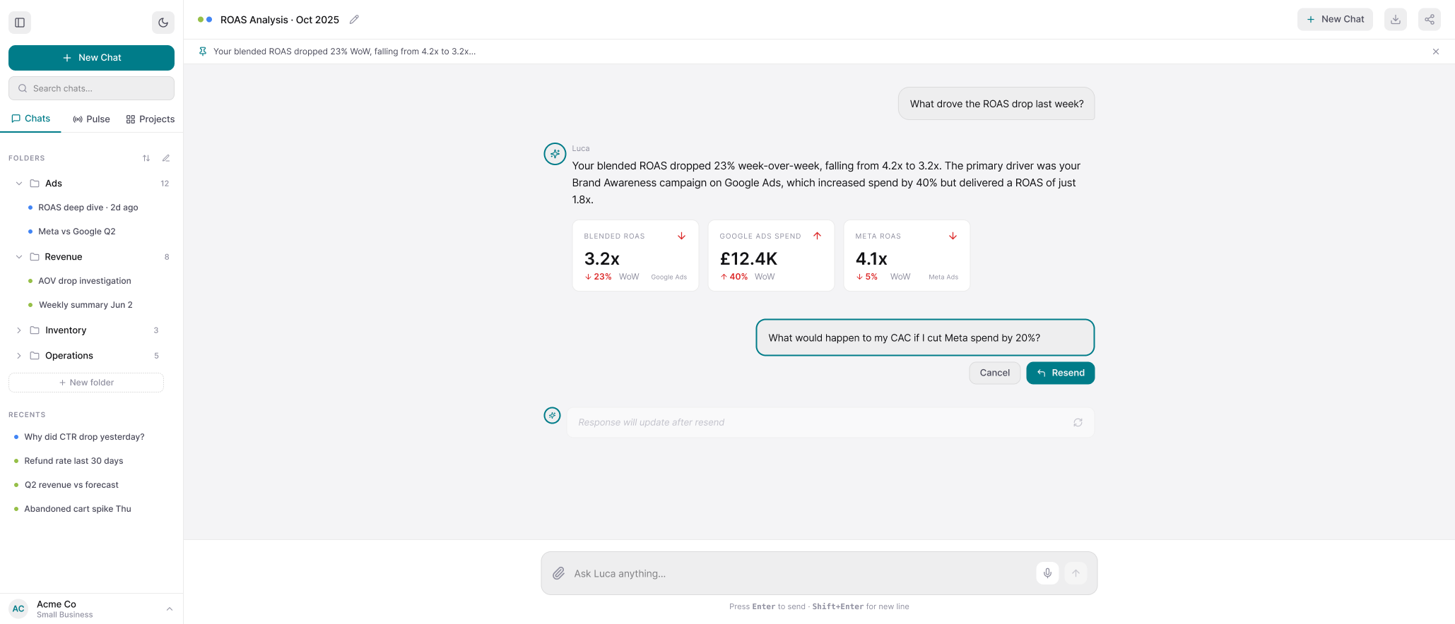
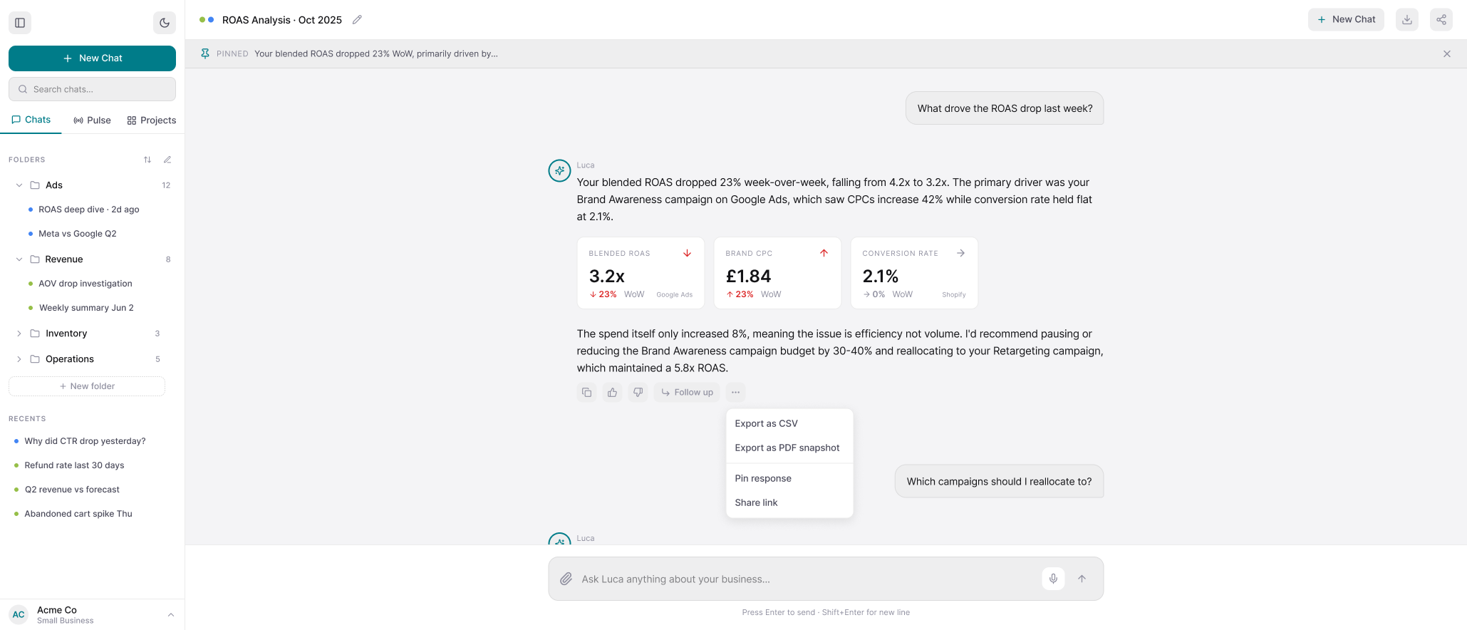
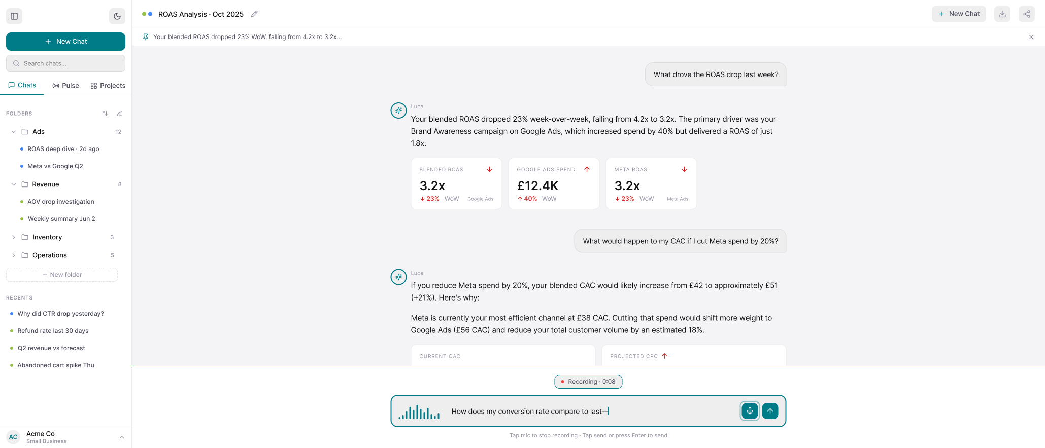
  10. Edit, export, speak

    Sent prompts can be edited and resent, responses exported or pinned, and questions spoken rather than typed, for accessibility.

Final Deliverable

Reflection

Studying Claude’s and ChatGPT’s sidebars before drawing my own was the decision that shaped everything after it. Luca’s users are busy founders, not power users of AI tools, and the real risk was a feature-rich menu that turned into a maze. Borrowing patterns they already knew let me save the new ideas for the places Luca actually differs: the check-in cards, the context buttons, and a source on every step.

Handing the redesign to engineers taught me that a design is not finished when the screens are. For each screen type I wrote a short document explaining the decisions and listing what was still open, because an unresolved question in a handoff quietly becomes an engineer’s assumption.

What I would do differently is look beyond Luca’s own client list for people to test with. I would network my way to founders of small eCommerce companies — the market Luca is built for, and the kind of business its current users run — and put a rough prototype in front of a few of them before settling the layout. Choices like how many check-in cards to show, or how short an answer can get before it stops being useful, rest on reasoning and competitor patterns rather than on watching someone use them. The measure I would want most is how long it takes a founder to get from opening Luca to an answer they can act on.

← All projects

Luca AI Web Application Redesign

Luca AI · UX Product Design Lead Intern · May – July 2026 · San Francisco Bay Area, CA (Remote)

Tools: Figma

  • UX Audit
  • Interaction Design
  • Prototyping
  • AI & SaaS
  • Web App
Redesigned Luca AI chat interface screens.Full size (opens the file)

Redesign Luca AI’s chat web app so a busy founder can find a past conversation, see what needs attention, and read an answer without scrolling through it.

Context

A bare history list with no search, a landing page standing in front of the chat, vague status lines, and long double-spaced answers that loaded scrolled to the end.

Read the full context

Luca AI’s web app is a chat interface where founders ask an AI co-founder about their business. Its side menu was a bare history list, with no way to organize or search chats for a user with unlimited questions and limited time. A landing page stood in front of the chat as an unnecessary cover, and status lines like ‘Putting it all together…’ raised more questions than they answered. Responses were long, text-only and double-spaced — one question produced seven sections — and loaded scrolled to the end, sending the reader back up to the top to start.
The original sidebar: a History header, one conversation, an empty column.
The original Luca sidebar: a ‘History’ header with a new-chat button, one saved conversation, a large empty column below it, and the signed-in user’s name beside a theme toggle at the bottom.Full size (opens the file)
The landing cover that stood in front of the chat.
The original landing cover: a yellow ‘connect a source’ banner above a centred circular logo, a large greeting headline, one line of description, four topic words and a ‘Start a conversation’ link.Cropped · full image (opens the whole file)
Behind it: a mostly empty page with one input pinned to the bottom.
The screen behind the cover: the same banner over a mostly empty page reading ‘Start the conversation…’, with a single ‘Ask anything…’ input pinned to the bottom.Cropped · full image (opens the whole file)
‘Putting it all together…’ raised more questions than it answered.
A sent question in a teal bubble above three status lines — ‘Thinking…’ and ‘Searching the web…’ checked off, ‘Putting it all together…’ still in progress.Cropped · full image (opens the whole file)
Responses were long, text-only and double-spaced — seven sections for one question.
The top of a long answer: the question bubble, an opening line and section one, all double-spaced body text with no visuals.Cropped · full image (opens the whole file)
…and loaded scrolled to the end.
The same response scrolled to its seventh numbered section, showing nested bullet lists, a pull-quote block and a closing paragraph, with the scrollbar sitting near the bottom of a long answer.Cropped · full image (opens the whole file)

The original app screens

Constraints

  1. Founders short on time

    Users could ask Luca anything, as often as they liked, but had little time to sift through the answers — so every screen had to get to the point.

  2. A product that was already shipped

    New ideas had to be balanced against the app’s existing function and a brand its users already knew.

  3. No design system to inherit

    Beyond a handful of hex codes there was nothing to build from, so I first set down a basic system — color, type and spacing — and designed each component from scratch on top of it.

  4. An 8-hour time difference

    With a UK-based team, most of the collaboration happened asynchronously, through recordings, notes and daily updates.

  5. No access to users

    US clients did not respond to interview requests, and the time difference made sessions with EU clients hard to schedule, so the redesign rests on competitor patterns and reasoning rather than on interviews.

Light
accent
accent-light
bg-base
bg-surface
bg-elevated
text-primary
text-secondary
text-muted
Dark
accent
accent-light
bg-base
bg-surface
bg-elevated
text-primary
text-secondary
text-muted
Type
For headings,Sora
For body text,Plus Jakarta Sans
Buttons
primary
secondary
ghost
icon
destructive
Motion
80mslinearduration-instant
150msease-outduration-fast
220msease-in-outduration-base
300mscubic-bezier(.16,1,.3,1)duration-enter
500mscubic-bezier(.22,1,.36,1)duration-complex
The style foundation every screen was built on

Key Features

  1. Folders and chat search

    Chats can be organized into folders and found by search, instead of scrolled for in one long history.

  2. Recents within reach

    A recents section keeps the chats a user returns to most one click away.

  3. One place for settings

    The profile section at the foot of the menu follows the familiar LLM pattern, and holds both user and business settings.

  4. Check-in cards

    The landing opens on insight cards color-coded by priority, each with a ‘Go to chat’ link, so a founder sees what needs attention first.

  5. Context before the question

    A row of buttons sets context before a prompt is written, so it does not have to be typed into every one.

  6. Progress you can see

    The endless loading loop became a progress bar, keeping the step-by-step checkmarks.

  7. Sources on every step

    Each step names the data source Luca is pulling from, giving oversight and a place to start troubleshooting a wrong answer.

  8. Answers as cards

    Metric cards show a trend at a glance, as a number and in context, with its source — so an answer needs little or no scrolling.

  9. Jump to latest, on request

    An arrow beside the chat jumps to the newest response, instead of the page jumping there on load.

  10. Edit, export, speak

    Sent prompts can be edited and resent, responses exported or pinned, and questions spoken rather than typed, for accessibility.

Final Deliverable
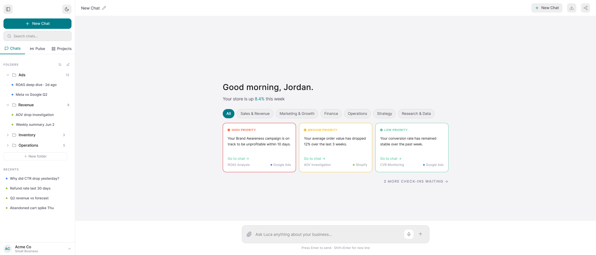
The new sidebar: folders, chat search, recents, and settings in the profile at the foot.
The redesigned landing screen: a sidebar of folders, chat search and recents beside a greeting, a row of context filter buttons, and three color-coded check-in cards each ending in a ‘Go to chat’ link and a named data source.Cropped · full image (opens the whole file)
The landing opens on check-in cards color-coded by priority, under a row of context buttons.
The redesigned landing screen: a sidebar of folders, chat search and recents beside a greeting, a row of context filter buttons, and three color-coded check-in cards each ending in a ‘Go to chat’ link and a named data source.Cropped · full image (opens the whole file)
The loading loop became a progress bar with checkmarks, each step naming its data source.
The redesigned status indicator: two completed steps checked off and a third in progress above a teal progress bar, with Shopify and Meta Ads source chips beneath and an estimated time remaining under the input.Cropped · full image (opens the whole file)
Answers as cards: a trend at a glance, in context, with its source.
A response built from a short paragraph, three metric cards giving blended ROAS, brand CPC and conversion rate with trend arrows and source labels, and a closing recommendation, with a circular jump-to-latest arrow at the right edge.Cropped · full image (opens the whole file)
An arrow jumps to the newest response, on request.
A response built from a short paragraph, three metric cards giving blended ROAS, brand CPC and conversion rate with trend arrows and source labels, and a closing recommendation, with a circular jump-to-latest arrow at the right edge.Cropped · full image (opens the whole file)
A sent prompt reopened for editing and resending.
A sent prompt reopened for editing in an outlined field with ‘Cancel’ and ‘Resend’ buttons, and a greyed placeholder below it reading ‘Response will update after resend’.Cropped · full image (opens the whole file)
Responses can be exported, pinned or shared.
An overflow menu opened under a response, offering ‘Export as CSV’, ‘Export as PDF snapshot’, ‘Pin response’ and ‘Share link’, with a pinned-response bar across the top of the chat.Cropped · full image (opens the whole file)
Questions can be spoken: a recording pill, a waveform and live transcription.
The composer in recording mode: a ‘Recording · 0:08’ pill above an outlined input showing a waveform and live transcribed text, with the microphone and send buttons highlighted.Cropped · full image (opens the whole file)

Reflection

Borrowing patterns founders already knew saved the new ideas for where Luca differs; next time I would test a rough prototype with founders first.

Read the full reflection

Studying Claude’s and ChatGPT’s sidebars before drawing my own was the decision that shaped everything after it. Luca’s users are busy founders, not power users of AI tools, and the real risk was a feature-rich menu that turned into a maze. Borrowing patterns they already knew let me save the new ideas for the places Luca actually differs: the check-in cards, the context buttons, and a source on every step.

Handing the redesign to engineers taught me that a design is not finished when the screens are. For each screen type I wrote a short document explaining the decisions and listing what was still open, because an unresolved question in a handoff quietly becomes an engineer’s assumption.

What I would do differently is look beyond Luca’s own client list for people to test with. I would network my way to founders of small eCommerce companies — the market Luca is built for, and the kind of business its current users run — and put a rough prototype in front of a few of them before settling the layout. Choices like how many check-in cards to show, or how short an answer can get before it stops being useful, rest on reasoning and competitor patterns rather than on watching someone use them. The measure I would want most is how long it takes a founder to get from opening Luca to an answer they can act on.

  • UX Audit
  • Interaction Design
  • Prototyping
  • AI & SaaS
  • Web App
← All projects